Article Highlights:
- De Grey Mining (DEG)
- Emerald Resources (EMR)
- Newcrest Mining (NCM)
- Northern Star (NST)
- Ramelius Resources (RMS)
- Resolute Mining (RSG)

Gold is back in the news as the banking crisis in the USA has spurred renewed interest in the precious metal. Long considered a store of value, gold tends to do well in times of uncertainty. Banking crisis, uncertainty, check!
Note though, it's gold's impeccable credentials as an alternative to fiat currencies during periods of their de-basement by money printing central banks which has many predicting now is gold's time to really shine (ok, terrible pun!).
Yesterday I expanded upon the above concepts in an article
containing comprehensive analysis of the main factors impacting gold. It's worth a read before reviewing this article which focusses on the strongest Aussie gold stocks from a technical perspective. They are listed below in alphabetical order.
Don't forget, each Tuesday you can join me live in my
ASX Edition of Live Market Analysis and ask me to analyse your favourite ASX gold stocks.
De Grey Mining (DEG)
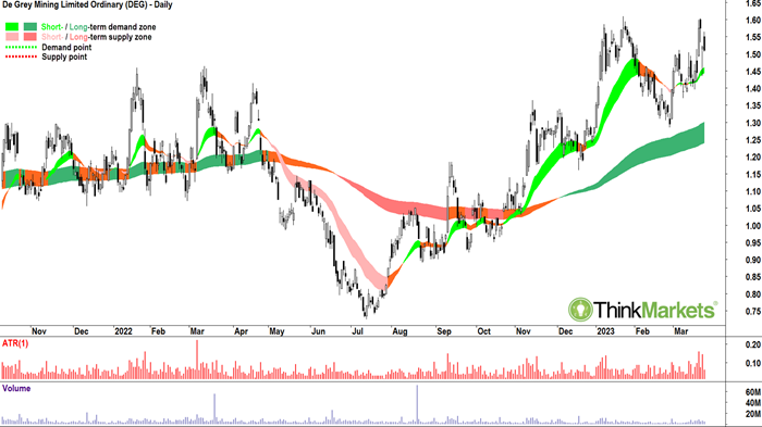
This list it alphabetical, but by coincidence we start with the only gold stock in this list which is not yet a producer. There are hundreds of companies listed on the ASX which are exploring for gold, hoping to find it, and then eventually prove there's enough of it in the ground to warrant the cost and effort of digging it out.
Even if you do find a deposit of economic scale, it's probably going to take around 5 years and hundreds of millions of dollars to get to mine.
DEG is more advanced than most gold hopefuls on the ASX. It's Mallina project, which is near Port Hedland in WA is at what you call "Pre-feasibility study (PFS) stage. Getting here is the first major hurdle for any mining company as it pulls together reserves, logistics, and funding. DEG's PFS indicates an impressive 20 Moz of resources and 5 Moz of reserves and an annual production target of 540,000 oz p.a. over the first 10 years of the project's life. . Exploration activities are ongoing to increase both of these values.
PFS is mining speak for "only part-way down the track", though. Next must come the "Definitive feasibility study (DFS)", and then the "Final investment decision (FID)". Now, there's also plenty of other boxes to tick, not the least including finding the $1 billion or so of capital required to get fund Mallina to production. My guess is, best bet, unlikely you'll see the first ounce of gold poured within the next 2 years.
The question of production or no production is less important to me, I just like the chart! It shows a nice bottom-left-top-right pattern and is a picture of excess demand. I'd be happy to add risk around current levels in anticipation of a break of the 23 Jan major supply point at $1.61.
Bias: Long until a close below the 27 Feb low of $1.285.
Emerald Resources (EMR)
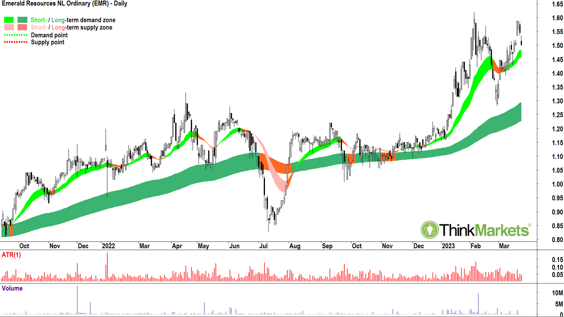
EMR is the smallest in this list with respect to reserves and production. It's resources of 900,000 oz and reserves of 100,000 oz p.a. at its Okvau Gold Mine in Cambodia are modest, but EMR boasts the lowest cost production of any miner in this list. It's AISC of just US$740-US$810/oz is global benchmark stuff. It also has plenty of exploration upside to potentially pad out those reserves and production.
Again, I just like EMR's chart. Another prime example of a bottom-left-top right setup. The market has done its research and it loves EMR. This is the only conclusion one can draw from such a chart!
Demand, well clearly there's plenty of demand. Why? Why does anyone buy any stock? Because buyers believe the stock is a bargain. Similarly, very few sellers are apparent, even despite the ascent in price. Why? Why would anyone choose not to sell? Because shareholders believe the stock is a bargain! So, if both buyers and sellers believe the stock is a bargain, who am I to argue?
Bias: Long until a close below the 28 Feb low of $1.28.
Newcrest Mining (NCM)
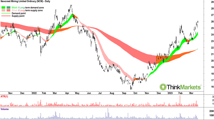
NCM is Australia's number one gold miner in all departments. Market capitalisation, $22 billion, check. Resources? 104 million oz Check. Reserves? 5 million oz, check. Annual production? 2 million oz (Moz) per annum, check. NCM isn't just big by Australian standards, is qualifies as a major global gold producer. Even better, it's able to produce its gold at one of the lowest costs compared to its global peers. Gold miners measure their costs using a metric called "all-in sustaining cost" or "AISC" for short. NCM's AISC is a very low US $1,098/oz.
You would have had to have been living under a rock not to know that NCM also caught the attention of the world's biggest gold miner, Newmont Mining. Newmont's (NYSE ticker NEM) all-scrip bid ultimately failed, but it highlighted the attractiveness of NCM's large and low cost production to other majors (FYI, Newmont's has a market capitalisation of US$37 billion and annual production of over 6 Moz per annum).
For completeness, I did also take a gander at the charts of major gold producers before writing this article, and I can confirm NCM's chart is the best of the bunch.
Looking to the technicals, NCM's price is in both a short-and long-term uptrend as evidenced by rising light green and dark green trend ribbons. The fledgling long-term is still very early stages, however, which means NCM's chart pattern is more of a "turnaround play" than the usual "bottom-left-top-right" setup I would usually seek out.
Checking the price action next, that is, the relationship between the peaks and troughs. We can see NCM's price action showing higher peaks and higher troughs. This is an indicator of increasing demand and diminishing supply, a big tick when considering adding some riskto any stock.
Candles, next. Here I need to see demand-side candles. These are the ones with white bodies and or lower shadows. Pretty much since the 27 Feb swing low of $22.43, NCM's candles have been skewed towards the demand-side. This is another tick when considering adding risk to NCM.
Finally, let's consider relevant points of demand and points of supply. There is a major point of supply at the 9 Feb high of $25.56 which appears to have been removed. Candles near this level indicate excess demand remains strong. The next important point of supply is expected at the 19 Apr major swing high of $28.59. There's nothing majorly negative in NCM's chart to indicate it cannot test this level.
Bias: Long until a close the 27 Feb low of $22.43
Northern Star (NST)
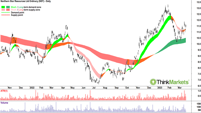
The award for second place in the Australian gold sector goes to NST. It's market capitalisation is still an impressive $13 billion, and its resources vs reserves of 56 Moz vs 21 Moz, as well as production of 1.6 Moz per annum still slots it in the bottom rung of what can be considered globally significant producers. In terms of costs, it's not too far up the curve compared to NCM with an AISC of US$1,236/oz. This is still at the lower end of the global cost-of-production spectrum.
NST's chart is similar to NCM's. I observe a long-term uptrend which was also held well with a double bottom pattern. The short-term trend (amber ribbon), however, isn't up like NCM's, but it does appear to be in advanced stages of transitioning back to that direction.
Price action is good, not great, as it is more congested than NCM's, but save for a wobble between 14-17 Mar is for the most part higher peaks and higher troughs. Candles are skewed towards the demand side, but again, perhaps not as convincingly compared with NCM's candles.
So, we find NST is second fiddle to NCM on the technicals as well. Still, I'm a happy holder for now. Along with NCM, this is one we follow closely in my
Tuesday sessions where we've been adding risk for a couple of weeks now. I'd be open to continue to add risk if I observe any subsequent demand-side candles over the next few sessions.
The next obvious upside target for NST is the major swing high set at $13.31 on 2 Feb.
Bias: Long until a close below the 27 Feb low of $10.14.
Ramelius Resources (RMS)
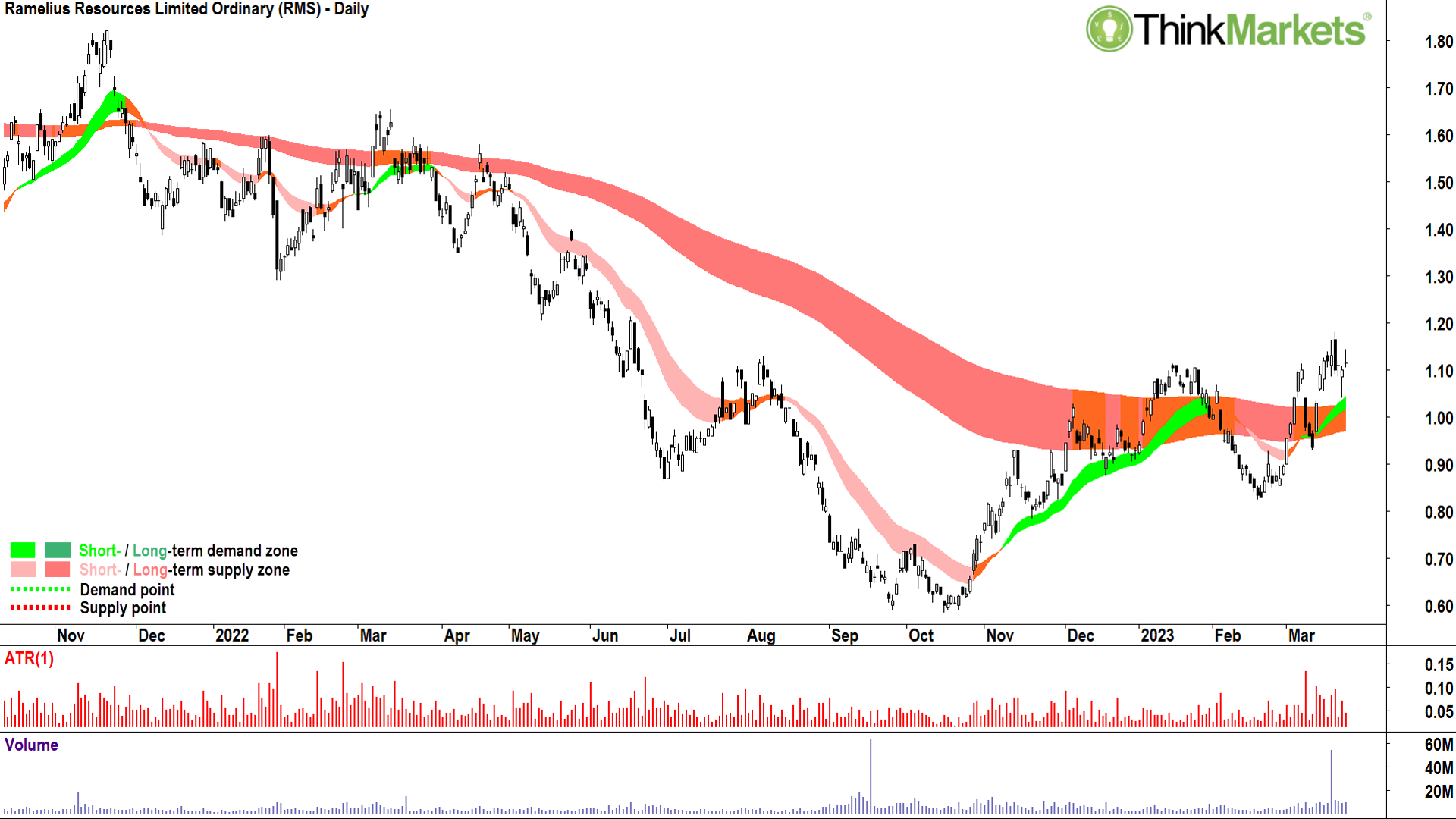
RMS is at the lower end of what we would classify as "mid-tier" producers. It has annual production of 260,000 oz p.a. from two Western Austalian-based mines, resources/reserves of 6.2 Moz/1.1 Moz respectively, and an AISC of around US$1,500/oz (roughly in the middle of the production costs spectrum).
The RMS chart indicates its short-and long-term trends are not as well established to the upside as say, NCM or EMR. Indeed, the long-term trend is still transitioning from the downtrend which plagued RMS for most of what was a very bleak 2022. Most importantly here, the long-term trend ribbon increasingly appears to be a zone of dynamic support – this is crucial to confirming a new long-term uptrend for RMS.
Despite only an early-stage potential long-term uptrend, the RMS's price action is solid enough, and the candles since the 17 Feb swing low are actually some of the best in any of the charts shown here today. All in all, RMS is a bit of a roughie, but I'd be happy to add a little risk here.
Upside targets are initially to a band of potential supply likely sitting between the 29 Sep 2021 and 31 Jan 2022 trough lows of $1.24-$1.29, and then to the 14 Mar 2022 peak high of $1.65.
Bias: Long until a close below the 10 Mar low of $0.93.Resolute Mining (RSG)
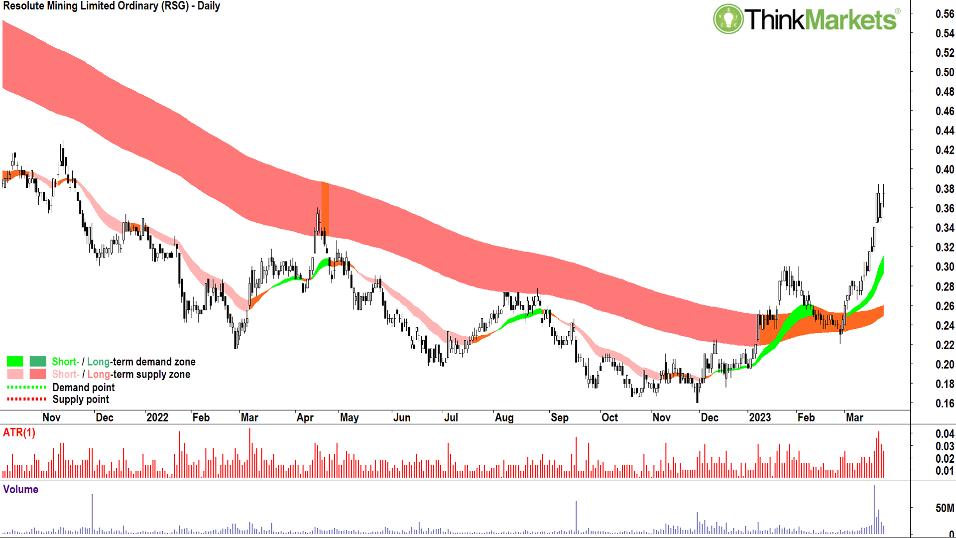
Last but not least, RSG is sitting on some impressive resources/reserves with as much as 11.2 Moz/4.6 Moz in the ground at their two African gold mines in Mali and Senegal. Production-wise its comfortably mid-tier with around 353,000 oz of production p.a. on an AISC of approximately US$1,400.
The RSG chart shows a solid run up through March as the company significantly upgraded their resources and reserves. Like RMS, the long-term trend zone is still amber, but is in the process of transitioning to an uptrend and does appear to be offering dynamic support to price.
The price action is exemplary, with clear separation on rising peaks and troughs. The abundance of demand-side candles are the best on any chart in this list.
If I have one criticism of the RSG chart, it's that it's run a little too hard! Preferably, I get to buy a stock showing solid short-and long-term uptrends, with great price action and candles…and which is close to my short-term uptrend ribbon (light green zone). RSG has just pushed a bit too far from its short-term trend ribbon for my liking.
This doesn't mean I am averse to simply running out and adding some risk right now – I'm not, but I'd rather wait for a pullback first. In this regard, I'll be watching for some demand-side candles around the old supply zone from the January highs at $0.30.
Bias: Long until a close below the 8 Mar low of $0.265.Learn More, Earn More!
Want your portfolio questions answered? Register for next week's Live Market Analysis sessions and attend live! You can ask me about any stock, index, commodity, forex pair, or cryptocurrency you're interested in.
REGISTER:
Live Market Analysis Webinars - Tuesdays & Thursdays 1pm, Friday 12pm AEST
You can catch the replay of the last episode of Live Market Analysis here:
COMPREHENSIVE ASX Gold Sector Review, What's driving Gold now?