How to read the indicator
The Parabolic SAR plots dots on the chart, showing the direction of the short-term trend. When the dots are below the candlesticks, it suggests that there is buying pressure underneath, pushing the market higher. You will notice how these dots run in consecutive strings, keeping the trader in the trend longer than they may be willing to get involved in without them.
The idea is that the indicator tells you which direction the market is moving, but it also tells you where to put your stop loss. The stop loss goes at the dot, and if it gets hit you will notice that the dots switch sides, changing the overall trend. For example, if the dots are underneath candlesticks, then you are a buyer with your stop loss moving every time the new dot is presented. Eventually, the market hits that stop loss, and then flips the direction of the indicator, telling the trader to switch the direction in which they are trading.
There are a couple of things that should be noted here, for example that this is a trending type of indicator. It also gives a bit of a wide berth for stop losses, so it is easier to deal with this indicator and use it effectively on shorter-term charts. In fact, that’s how most traders use it.
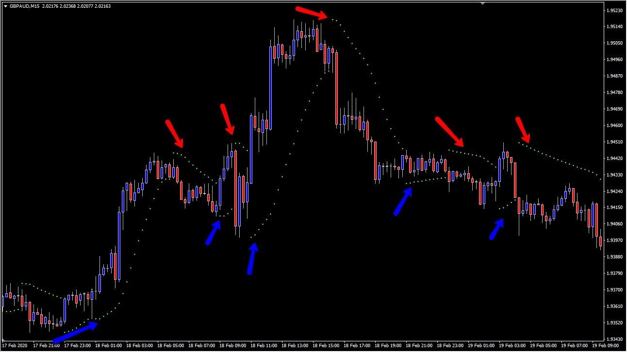
Take a look at the following chart. It’s a 15 minute GBP/AUD pair chart and notice that although there were some whipped cells along the way, the trades that work out are quite explosive.
On the chart, you can see that the market rallied quite significantly, then whipsawed a bit, only to rally again. In other words, you probably had two very small losses in comparison to a couple of decent gains. The rollover from the highs of the chart were a nice selling opportunity, followed by a relatively flat market that produced a couple of choppy moves that probably went against you before your stop loss was hit. In other words, it should become apparent that the indicator is not to be used in a range-bound type scenario.
The one major advantage of this indicator, though, is that it’s completely mechanical, therefore, you know where your stop losses are and you know when it’s time to get out. In a sense, it can be thought of as an algorithm, but was calculated by the trader themselves, as it has been around since before algorithmic trading became really popular.
Quite often, a lot of the issues that you run into with the Parabolic SAR indicator can be smoothed out by following a couple of key points.. After all, the market tends to be very noisy, and does tend to be unidirectional most of the time. Granted, you will get the occasional pullback, but overall trends tend to last much longer than pullbacks do, and therefore most of the money is made hanging onto the trend. It’s in this scenario that the Parabolic SAR indicator shines.
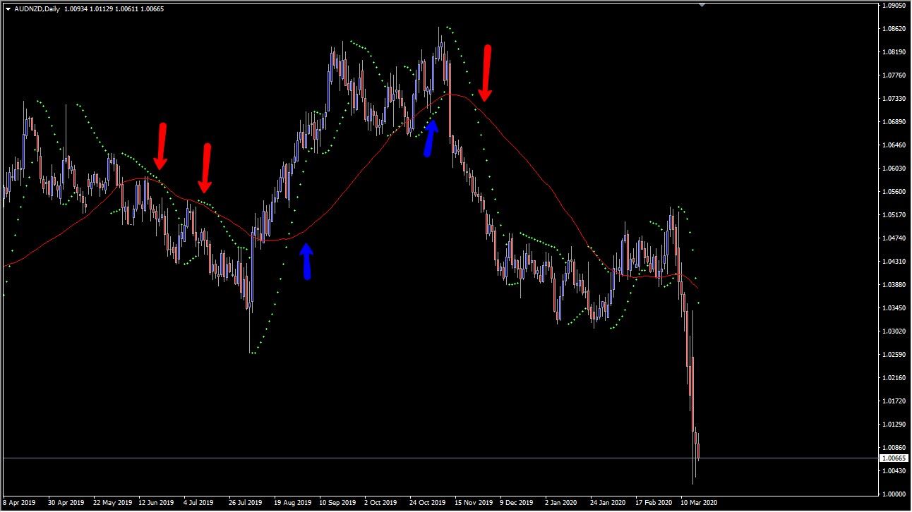
After that, the market broke above the 50 day SMA and once the Parabolic SAR dot was printed above the 50 day exponential moving average, or EMA, the trader using both of these indicators would have gone long. You can see that the trade lasted for quite some time, before pulling back towards the 50 day SMA again. This allows an opportunity to go long and once the indicator flashed all of the dots underneath, traders would have been buyers.
Just as we saw with the big move higher, the indicator started to flash a sell signal before it crossed over the 50 day SMA, which was a confirmation that you should start selling again. As you can see, this combination can be quite useful. However, in general, moving averages tied into the Parabolic SAR tend to work better with
longer-term charts, making it a bit of a hybrid system as the Parabolic SAR itself does well on a shorter time frame. Adding a moving average seems to be even more filtered and reliable, at least on longer time frames.