ThinkMarketsThinkMarkets

Indicators and patterns

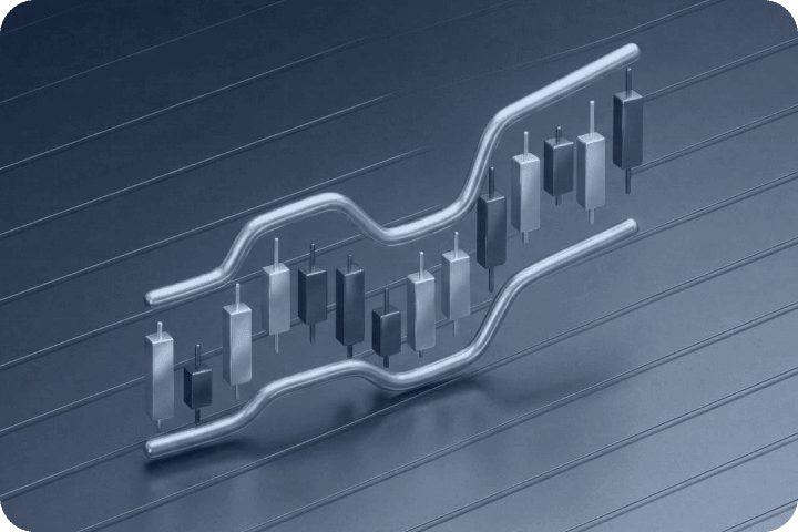
Discover how to identify potential trading opportunities by reading and analysing charts effectively. 

Articles (46)

All
Beginners
Experienced
Fibonacci ratios

Fibonacci ratios

<p>The Fibonacci ratios commonly used are 100%, 61.8%, 50%, 38.2%, 23.6% - these are shown as horizontal lines on a chart and may identify areas of support and resistance. These levels are created by drawing a trend line between two extreme points and diving the vertical distance by the key Fibonacci ratios. These extreme levels are known as the recent swing high and swing low,&nbsp;<br /> <br /> To identify the Fibonacci levels for an uptrend, click on the swing low and draw the trend line to the swing high. In a down trend you simply reverse the trend line. The following chart shows the Fibonacci levels on price which is in an uptrend.<br /> <br /> <img alt="Fibonacci Retracement" src="/TMXWebsite/media/TMXWebsite/Fibonacci-Retracement.png" style="vertical-align: middle;" /><br /> <br /> As you can see on the chart, we have plotted the Fibonacci levels by clicking on the swing lows at 1.000 and swing highs at 1.14. The Fibonacci levels plotted show where price travels to and reverses, and are evident at the 61.8%, 38.2% and 23.6% levels. The 61.8% level is a common support level, as in the above example you can see the price has tested this level on many occasions. More recently, you can see where the price broke through the 38.2% level and retested this level. In this example there&rsquo;s an expectation for the currency pair to test the 23.6% level at 1.11.<br /> <br /> The next chart shows the Fibonacci ratios plotted for the pricing action in a down trend.&nbsp; As you can see, we&rsquo;ve drawn a trend line from the swing high at 1.1037 to the swing low at 1.0994. Again, you can clearly see where the price reversed at key Fibonacci levels such as the 50% and 23.6% levels.<br /> <br /> <img alt="Fibonacci Retracement" src="/TMXWebsite/media/TMXWebsite/Fibonacci-Retracement-2.png" style="vertical-align: middle;" /><br /> <br /> Fibonacci levels are by no means fool proof &ndash; they&rsquo;re not areas where you would buy and sell from. You should look at them as areas of interest &ndash; an indication of where the price may go to in the future.<br /> &nbsp;</p> <h3><strong>Combining Fibonacci ratios with support and resistance</strong></h3> <p>Fibonacci ratios can be subjective, but can also be used to identify key support and resistance levels. A potential way to use the Fibonacci levels is to spot potential support and resistance levels, and see if these levels line up with the Fibonacci levels. If you do spot these levels, the chances of the price bouncing off them are higher.<br /> <br /> <img alt="Fibonacci Retracement" src="/TMXWebsite/media/TMXWebsite/Fibonacci-Retracement-and-Support.png" style="vertical-align: middle;" /><br /> <br /> As you can see from the chart, the key Fibonacci levels 61.8% and 38.2% have been areas of support and resistance previously, and by identifying this on the chart, these levels can potentially be areas where you could enter the market. With traders looking at the same support and resistance levels, there&rsquo;s a good chance that there will be a number of orders around those levels.&nbsp;<br /> &nbsp;</p>

6 min readBeginners
A Complete Guide to Japanese Candlesticks

A Complete Guide to Japanese Candlesticks

<p>A Japanese candlestick is a technical tool used by traders to pack price information into a single candle. They are considered an extremely useful tool, since the traders are able to easily see and analyse a large amount of data.</p> <h2>Origins of the Japanese candlesticks</h2> <br /> Japanese candlesticks go back to as far as the 18th century. A Japanese trader Munehisa Homma traded rice in the local markets. He also served as an adviser to the Japanese government.&nbsp;<br /> <br /> Homma started recording prices of rice on a daily basis, including opening price, high, low, and close. After some time, he started noticing patterns that were repetitive.<br /> <br /> In 1755, he wrote a book titled:&nbsp;<br /> <br /> <br /> <strong>The Fountain of Gold &mdash; The Three Monkey Record of Mone,</strong>&nbsp;<br /> discussing the psychological aspects of the trading process.&nbsp;<br /> <br /> He is believed to be the first person to realise that the behaviour of other participants in the market is a crucial element in trading. The emotions of traders play a huge part in their decisions. Homma realised this and took advantage while trading the rice.&nbsp;<br /> <br /> Homma is also known for introducing the <strong>Sakata Rules</strong><br /> <br /> A set of five rules that outline patterns developed by local traders. It is exactly this set of rules that created the basis for the birth of Japanese candlesticks.&nbsp;<br /> <br /> It was not until the end of the previous century that Steve Nison introduced the concept of Japanese candlesticks to the wider public in a classic investing book titled:<br /> <br /> &nbsp;<strong>Japanese Candlestick Charting Techniques.</strong><br /> <br /> The essence of this concept is the psychology of a trader, which we will&nbsp;discuss&nbsp;in detail&nbsp;below.<br /> &nbsp; <h2>The key elements of Japanese candlesticks</h2> &nbsp; <p>A Japanese candlestick consists of four main elements:&nbsp;<br /> &nbsp;</p> <ul> <li>Opening price&nbsp;</li> <li>Highest point reached by the asset&rsquo;s price</li> <li>Lowest point reached by the asset&rsquo;s price</li> <li>Closing price of the candle</li> </ul> <p>&nbsp;</p> <p><img alt="structure of a Japanese candlestick" src="/TMXWebsite/media/TMXWebsite/structure-of-a-Japanese-candlestick-pic-2.jpg" /></p> <p>&nbsp;</p> <p>As seen in the photo above, the four elements create two parts of the candle: the&nbsp;<em>wick</em>&nbsp;(extending up and down) and the&nbsp;<em>body</em> that consists of the opening and closing prices. The wick&nbsp;can be long or short, depending on the price movements.<br /> <br /> As such, candlesticks differ from the simple bar charts by displaying more information, but in such a way that they are still easy to read.&nbsp;</p> <p>&nbsp;</p> <p><img alt="narrow- and wide-spread candlestick" src="/TMXWebsite/media/TMXWebsite/narrow-and-wide-spread-candlestick-pic-3.jpg" /></p> <p>&nbsp;</p> <p>Traders usually use either green (<em><strong>bullish</strong></em>) or red (<em><strong>bearish</strong></em>) colour to paint the candlestick, although some also use white (bullish) and black (bearish) as well.</p> <p>&nbsp;</p> <p><img alt="green (bullish) and red (bearish) colors" src="/TMXWebsite/media/TMXWebsite/green-(bullish)-and-red-(bearish)-colors-pic-4.jpg" /></p> <p>&nbsp;</p> <p>As seen in the photo above, the <strong><em>bullish candle</em></strong> is formed when the close&nbsp;is higher than the open, and the opposite is the case for the <em><strong>bearish candle.</strong></em> There is a wide range of different shapes, from those with long wicks to either side to those with almost no body.&nbsp;<br /> <br /> The top of the upper wick shows the session&rsquo;s high and vice versa. The longer the distance between the high and the low, the wider the price range of the given session is.&nbsp;<br /> <br /> You can test how different Japanese candlestick patterns work by trading without risking your capital first, by <a href="https://portal.thinkmarkets.com/account/individual/demo"><u>opening a demo trading account</u></a>.&nbsp;</p> <h2>What the Japanese candlesticks tell you</h2> <p>As noted earlier, the Japanese candlesticks are important as they display data to traders that reflect the state of the market. Based on the key elements, traders can better understand the prevailing trend in the market and which side has the upper hand.&nbsp;<br /> <br /> Looking at the image above, we see the EUR/USD daily chart. At the right end of the chart we see a series of long and green candles. This type of candle is very strong as the body is long and the close is usually near the top of the candle. It means that the bulls are in control of the price action as they could facilitate a series of wins that brought them huge gains.&nbsp;<br /> <br /> A clean uptrend, which is characterised by a series of higher highs and higher lows, sends a message that there is a continuous interest from the side of buyers to push the price higher. On the other hand, the long and red candles are a sign of strong selling pressure.&nbsp;<br /> <br /> It is exactly the relationship between individual candlesticks that creates patterns that help traders predict future price changes.&nbsp;</p> <h2>The most popular candlestick patterns&nbsp;</h2> <p>There are two major groups of candlestick patterns: <em>bullish vs bearish</em>, and then there are <em>reversal, transitional </em>and <em>continuation</em> patterns. Patterns also differ based on the number of candles, starting from a single-candle formation to those consisting of two and three candles.&nbsp;<br /> <br /> Bullish patterns are those that predict that the price of an asset is likely to rise while the latter indicate the price is likely to fall. A reversal pattern signals a potential change in direction, while the continuation, as the name itself says, signals an extension of the current trend.&nbsp;<br /> <br /> In the section below, we will discuss the five most powerful candlestick patterns used by traders to predict price movements and make profits. All of these patterns generate a sign or message only, and you should consult other technical indicators before you engage in a trade.<br /> <br /> For this purpose, we have prepared <strong>detailed guides</strong> to explain the best candlestick patterns with examples and how to use them in your trading strategy. See a <strong>short summary</strong> for <em>the most popular ones&nbsp;below</em> or just <em>follow the links</em>&nbsp;here to the detailed guides gain deeper understanding:<br /> &nbsp;</p> <ul> <li><a href="~/en/trading-academy/forex/shooting-star-candlestick-pattern"><u>Shooting Star</u></a></li> <li><a href="~/en/trading-academy/forex/ascending-triangle-pattern"><u>Bullish and bearish engulfing patterns</u></a></li> </ul>

6 min readBeginners
What is a Rising Wedge?

What is a Rising Wedge?

<p dir="ltr">The <strong>rising</strong> (ascending)<strong> wedge</strong> pattern is a <em>bearish</em> chart pattern that signals an imminent breakout to the downside. It&rsquo;s the opposite of the falling (descending) wedge pattern (bullish), as these two constitute a popular wedge pattern. A rising wedge can be both a continuation and reversal pattern, although the former is more common and more efficient as it follows the direction of an overall trend.&nbsp;<br /> &nbsp;</p> <p dir="ltr">In this blog post, we discuss the rising wedge formation, its main characteristics, how to spot it, and how to make sure that your trades involving the rising wedge pattern are profitable.&nbsp;</p> <h2 dir="ltr">Where does the falling wedge occur?</h2> <p>Similar to <a data-di-id="di-id-d2dcb780-a21cf72e" href="/en/trading-academy/forex/falling-wedge-pattern">the bullish wedge</a>, the rising wedge&nbsp;consists of two converging trend lines that connect the most recent higher lows and higher highs. In a rising wedge, the lows are catching up with the highs at a higher pace, which means that the lower (supporting) trend line is steeper.</p> <p>&nbsp;</p> <p><img alt="rising wedge pattern" src="/TMXWebsite/media/TMXWebsite/Rising-wedge-image-1.jpg" /></p> <p>&nbsp;</p> <p>A rising wedge can occur either in the downtrend, when it is seen as a continuation pattern as it seeks to extend the current bearish move. Or it can occur in an uptrend, ultimately resulting in a&nbsp;reversal pattern. The former is considered to be a more popular, and more effective&nbsp;form of a rising wedge.&nbsp;<br /> <br /> As with the falling wedge, we note three key features of a rising wedge:<br /> &nbsp;</p> <ul> <li>The price action temporarily trades in an uptrend (the higher highs and higher lows)</li> <li>Two trend lines (support and resistance) that are converging</li> <li>The decrease in volume as the wedge progresses towards the breakout</li> </ul> <p><br /> The third point is seen more as a boost to the validity and effectiveness of the pattern, rather than a mandatory element. The decreasing volume suggests that the sellers are consolidating their energy before they start pushing the price action lower towards the breakout.</p> <h2>Strengths and Weaknesses of the Pattern</h2> <p>The main strength of an ascending wedge pattern is its ability to warn us of an imminent change in the trend direction. Despite the fact that the wedge captures the price action moving higher, the consolidation of the energy means the breakout is likely to happen soon.&nbsp;<br /> <br /> Given that the lows are progressing faster than the highs, the wedge is squeezing towards the point where the two trend lines intersect. Despite a push from the downside, the buyers are finding it difficult to break out to the upside, which triggers a move in the opposite direction.&nbsp;<br /> <br /> On the other hand, the rising wedge is still a technical indicator that only generates a signal. As every other indicator, it is not, and it can&rsquo;t be 100% correct in predicting future price movements. Thus, it is best applied alongside other technical indicators.&nbsp;<br /> <br /> The best possible way to identify the key strengths and weaknesses of a rising wedge is to start analysing the pattern yourself. For this purpose, <a data-di-id="di-id-555d44fe-1d3b3793" href="/en/metatrader5">MetaTrader 5 trading platform</a> offers a great trading environment which allows you to focus on the price action and get more familiar with this and other chart formations.&nbsp;</p> <h2>Spotting the rising wedge</h2> <p dir="ltr">Identifying a rising wedge is not so difficult. As a first step, you should eliminate all types of wedges that are present&nbsp;in the sideways-trading environment. The ascending wedge occurs either in a downtrend as the price action temporarily corrects higher, or in an uptrend.<br /> &nbsp;</p> <p><img alt="rising wedge pattern" src="/TMXWebsite/media/TMXWebsite/Rising-wedge-image-2.jpg" /></p> <p dir="ltr">Down here we have a USD/CHF daily chart. The price action is moving lower until a point when it creates a third in the series of the lower lows. Afterwards, the buyers start pushing the price again higher, creating a rising wedge.&nbsp;</p> <p>&nbsp;</p> <p dir="ltr">Finally, we have a breakout to the downside, as the buyers were unable to capitalise on the positive momentum they had. This wedge is a bit narrower as two trend lines converge quite quickly, which is positive from the risk/reward perspective.</p> <h2>Trading the Rising Wedge</h2> <p>We will now use the same chart to show how you should trade the rising wedge. Of course, there are many rising wedges that we can use to show how to trade the ascending wedge, however, we use the same chart to provide a continuity and complete the process - from spotting the wedge to finalising the trade.</p> <p>&nbsp;</p> <p><img alt="Trading rising wedge pattern" src="/TMXWebsite/media/TMXWebsite/Rising-wedge-image-3.jpg" /></p> <p>&nbsp;</p> <p>Hence, once we identify the wedge, we process towards the second stage when we look at the trade elements - possible entry, stop loss, and take profit. But first, pay more attention to two vertical red lines. In between these two, the volume is decreasing as the wedge progresses.&nbsp;<br /> <br /> The moment the volume breaks the decreasing trend is&nbsp;when the candle breaks out of the wedge. A higher volume behind the break is a great evidence that the breakout is happening, as you can see a strong increase in volume figures once the breakout starts taking place.&nbsp;<br /> &nbsp;</p> <strong>We also have three horizontal lines:</strong><br /> &nbsp; <ul> <li>black (entry)</li> <li>red (stop loss)</li> <li>and green (take profit)</li> </ul> <p>&nbsp;</p> <div dir="ltr">Entry is placed once we have a first daily close outside of the wedge&rsquo;s territory. A stop-loss should be set inside the wedge&rsquo;s territory as any return of the price action to the inside of the wedge invalidates the pattern.</div> &nbsp; <div dir="ltr">In this particular case, the distance between the entry and stop loss is very short, since two trend lines have almost intersected. Hence, the risk in this trade is extremely low. As with the falling wedges, the take profit is calculated by measuring the distance (the short blue vertical line) between the two converging lines when the pattern is first formed.</div> &nbsp; <div dir="ltr">Finally, we have our trade details: Entry - $0.9835, stop loss - $0.9855, take profit&nbsp; - $0.9695. Thus, we are risking 20 pips to make 140 pips, which is an extreme scenario in the risk-reward context.&nbsp;</div> &nbsp; <p dir="ltr">Given the very small amount of pips that you risk with this scenario, you may also opt to decrease the amount of pips you are targeting from 140 pips to 70, given that a level of $0.9765 is where an important horizontal resistance is located. Choosing between these two options depends on your risk tolerance and overall trading approach.&nbsp;</p> <p>&nbsp;</p> <p dir="ltr">You can also check how both of these approaches work by opening trades on the demo account, which you can do here. This way you start practising first and choosing the best trading approach that fits your skill set, as one size does not fit all.&nbsp;</p> <p>&nbsp;</p>

6 min readBeginners
What is a shooting star candlestick pattern?

What is a shooting star candlestick pattern?

A shooting star pattern is found at the top of an uptrend, when the trend is losing its momentum.<br /> <br /> The shooting star is actually the hammer candle turned upside down, very much like the inverted hammer pattern. The wick extends higher, instead of lower, while the open, low, and close are all near the same level in the bottom part of the candle.<br /> <br /> The difference is that the shooting star occurs at the top of an uptrend. It&rsquo;s a bearish chart pattern as it helps end the uptrend. The inverted hammer, on the other hand, is a bullish chart pattern that can be found at the bottom of a downtrend and signals that the price is likely to trend upward.<br /> <br /> <strong><img alt="shooting star candlestick pattern" src="/TMXWebsite/media/TMXWebsite/Shooting-star-pattern_1.jpg" /></strong> <p dir="ltr">Both the green and red versions are considered to be shooting stars although the bearish (red) candle is more powerful given that its close is located at the mere bottom of the candle. Again similar to a hammer, the shadow, or wick, should be twice as long as the body itself.&nbsp;</p> &nbsp; <p dir="ltr">In general, <em>the longer the wick the stronger the reversal</em>, since the long wick signals the inability of the bulls to secure a high close.&nbsp;</p> &nbsp; <p dir="ltr">Some traders prefer to wait and see whether the next candle is a bearish one, which will confirm that the reversal is taking place.&nbsp;<br /> <br /> In both cases, an occurrence of the shooting star at the top of an uptrend only generates a signal of an impending reversal and it shouldn&rsquo;t be taken as a direct trading signal.</p> <h2>What a shooting star will show us</h2> <p dir="ltr">As outlined earlier, a shooting star is a <em>bearish</em> reversal pattern which signals potential change in the price direction. The uptrend is nearing its end as the momentum is weakening, and the sellers are feeling more confident that they can force a reversal in price action.&nbsp;</p> &nbsp; <p dir="ltr">For this reason, a shooting star candlestick pattern is a very powerful formation. Its shape gives the pattern a lot of attention as the wick always sticks out from the rest of the price action.&nbsp;</p> &nbsp; <p dir="ltr">This is especially the case when the wick of a shooting star is also the new short-term high.&nbsp;</p> &nbsp; <p dir="ltr">Thus, although the buyers were successful in pushing for a new high, they failed to force a close near the session&rsquo;s high. Their inability is now a chance for the sellers to reverse the price action and erase previous gains.&nbsp;<br /> &nbsp;</p> <p dir="ltr">Therefore, the shooting star&rsquo;s key strength is its ability to generate a reversal signal. Of course, it may not always be right, but it is considered to be effective and reliable. However, please note that this is still one signal generated by one of hundreds of technical indicators.&nbsp;</p> <p dir="ltr"><br /> For this reason, it is important to always cross-check the signal that a shooting star generates with other indicators, or other <a data-di-id="di-id-249ef9e4-1d3b3793" en="" forex="" href="" japanese-candlesticks="" trading-academy="">candlestick patterns</a>. For instance, in the vicinity of a shooting star there may be other formations that signal the reversal or indecision.<br /> <br /> You can try your hand at spotting the shooting star pattern along with other technical indicators using the <a data-di-id="di-id-249ef9e4-1d3b3793" href="/en/metatrader5"><u>Metatrader 5 trading platform</u>.</a></p> <h2>How to trade the shooting star pattern</h2> <p>Trading the shooting star formation is similar to trading a hammer. The focus is on the candle itself of course, especially its wick that extends higher. In the example below, we see a AUD/USD chart that moves in an uptrend.<br /> <br /> In the middle of the chart, the price action corrects lower just to get back higher again and quickly. What follows is the fresh high in the context of a long bullish candle. If you look at this candle only, the situation looks very positive for the bulls, as there is an uptrend in action and the new high has just been posted.</p> <br /> <img alt="AUD/USD trading the shooting star pattern" src="/TMXWebsite/media/TMXWebsite/chart-2-shooting-star_1.jpg" /><br /> &nbsp; <p dir="ltr">However, <em>the situation quickly changes</em>. The price action moves higher again in the session, fails to create a new high, and reverses to close at the low of the session. As a result, a shooting star candle is formed.&nbsp;</p> &nbsp; <p dir="ltr">The next candle is a long bearish candle that confirms that a reversal is taking place. Ultimately, the price action retreats 250 pips lower.&nbsp;<br /> <br /> Whenever you decide to trade the reversal that was initiated by a shooting star, the <u>stop loss</u> should always be placed above the candle&rsquo;s high. This is arguably the greatest strength of this pattern, and as it is with a hammer, it gives you a clear level to play against.<br /> &nbsp;</p> <p dir="ltr">Any sustainable move, with a high close, above the candle&rsquo;s high, invalidates the pattern. Take-profit order is dependent on your trading style and risk management. Our advice is to consult other indicators, like <a data-di-id="di-id-3e8356ea-b9dbef8f" href="/en/trading-academy/forex/analysis-fibonacci-ratios">Fibonacci</a>, trend lines, or moving averages, and decide whether to exit a positive trade or not.</p> &nbsp; <p dir="ltr">To demonstrate this, let us move your attention to a chart below. We have a NZD/USD trading sideways for the most part. In the middle part of the chart, the price action starts to move gradually higher.</p> <p dir="ltr">&nbsp;</p> <strong><img alt="NZD/USD trading the shooting star pattern" src="/TMXWebsite/media/TMXWebsite/chart-3-shooting-star_1.jpg" /></strong><br /> &nbsp; <p dir="ltr">At one point, there is a new high in place, above the horizontal resistance. However, the buyers lose control over the price action, which initiates the pullback. A failure at important resistance/support levels is not a normal failure, it is usually much more important. For this reason, the price action rotates back lower following a failure to clear the resistance and returns to support.&nbsp;</p> &nbsp; <p dir="ltr">The upper red line shows our stop-loss, which is around 20 pips above the session&rsquo;s high. Any move to these levels where our stopp-loss is means that the pair is in a breakout territory and there is no reversal.&nbsp;</p> &nbsp; <p dir="ltr">Our profit-taking order (the lower horizontal black line) is a simple trend line that shows where the pair bottomed during the previous attempt to move lower. Hence, we are looking for a pullback to the old support.&nbsp;</p> &nbsp; <p dir="ltr">In this situation, we are risking 20 pips to earn nearly 90 pips. A simple calculation shows that it is a 1:4.5 risk ratio, an extremely profitable trade. Opportunities as profitable as this one are quite rare in the markets, but this does demonstrate how powerful a shooting star candlestick pattern can be.</p> <br /> Before you start risking your own capital, you may want to consider<a data-di-id="di-id-52b20e36-40a28506" href="https://portal.thinkmarkets.com/account/individual/demo" target="_blank"> opening a demo trading account.</a> This way, you will practise with virtual funds and equip yourself with an array of trading patterns and formations to apply when you start trading live.<br /> &nbsp; <p dir="ltr">&nbsp;</p> <h2>Summary</h2> <p>A shooting star is a single-candle bearish pattern that generates a signal of an impending reversal. Similar to a hammer pattern, the shooting star has a long shadow that shoots higher, while the open, low, and close are near the bottom of the candle.&nbsp; &nbsp;<br /> <br /> It is considered to be one of the most useful candlestick patterns due to its effectiveness and reliability. &nbsp;<br /> <br /> The long wick extending upside signals the buyers&rsquo; inability to follow up on the earlier move higher, which provides the sellers with an opportunity to initiate a change in the price direction.</p>

6 min readBeginners
Triple Top Candlestick Pattern Trading Strategy

Triple Top Candlestick Pattern Trading Strategy

The triple top is a bearish candlestick pattern that occurs&nbsp;at the end of an uptrend. As a reversal pattern, the triple top formation suggests a likely change in the trend direction, after the buyers failed to clear the horizontal resistance in three consecutive attempts, the scenario opposite of the triple bottom pattern.&nbsp;&nbsp;<br /> <br /> In this blog post, we look at the structure of the triple top chart pattern and what the market tells us through this formation. We are also sharing tips on the simple triple top trading strategy that will help you make profits.&nbsp; <h2><br /> What the pattern tells us&nbsp;</h2> <br /> The triple top pattern is quite a straightforward formation. It consists of three consecutive highs/tops recorded at, or near, the same level. For this chart pattern to take place in the first place, the price action has to trade in a clear uptrend.<br /> <br /> Given that it requires three peaks to be created, it&rsquo;s almost impossible to find a perfect triple top pattern where both the horizontal resistance and the neckline are perfectly horizontal. Therefore, allow some space for a neckline to be bent, or one of the peaks printing mostly below or above the horizontal resistance.&nbsp;<br /> <br /> <strong>These are the three mandatory elements for the triple top pattern to take place:</strong> <ul> <li><strong>An uptrend</strong> - the asset&rsquo;s price must trade higher in a series of the higher highs and higher lows.</li> <li><strong>Horizontal resistance</strong> - a trend line connecting three roughly equal highs.</li> <li><strong>A neckline</strong> - a trend line that connects lows in between three peaks, and whose break signals the activation of the formation.</li> </ul> <p>&nbsp;</p> <p><img alt="a triple top chart pattern illustration" src="/TMXWebsite/media/TMXWebsite/Triple-Top-Image-1.jpg" /></p> <p>&nbsp;</p> <p>The occurrence of the triple top pattern signals a strong uptrend. The bulls must have been in a really positive momentum when one found enough power and strength to test the horizontal resistance three times in a row. In most cases, the price action reverses after the second failure.<br /> <br /> Therefore, the triple top pattern is used as a tool to change the trend direction. The buyers had been long in control, making gains in an uptrend. After a period of the bulls&rsquo; dominance, which is likely to end after the three failed attempts to clear resistance, the sellers start growing in the game, threatening to reverse a trend of the price action.&nbsp;<br /> <br /> After the third unsuccessful failed attempt to break the resistance, the probability of the neckline break increases. Once it occurs, the triple top pattern is activated. For this reason, the neckline is arguably the most important element of the triple top pattern, as its break activates the pattern and then helps us determine the stop loss and take profit levels.&nbsp;</p> <h2>Strengths and weaknesses</h2> Due to its design, the triple top pattern is a rare, but a very powerful pattern. The fact that the buyers failed in as many as three successive attempts to break higher makes the reversal extremely powerful. These failures make them feel exhausted and vulnerable, which presents an opportunity to sellers to erase earlier gains of the opposite side.&nbsp;<br /> <br /> The triple top pattern occurs less frequently than the double top, as there is one peak less to happen. It also reduces the chances of a breakout as the buyers are left with no energy after the third failure.&nbsp;<br /> <br /> On the other hand, the fact that it is a rare chart formation is also its biggest weakness. For instance, you would need to spend some time on a chart before you can identify a clean triple top pattern that meets all the required criteria. <h2>Spotting the triple top pattern</h2> <p>Remember, the triple top is a bearish reversal pattern that stems from an uptrend. In the chart below, we have a USD/CAD on a 4H chart moving aggressively higher on the left side of the chart.<br /> <br /> The price action then hits a $1.29 horizontal resistance and fails to clear it, causing the first bigger correction since the trend was initiated. The buyers use this correction to regroup and regain confidence and launch another assault at the same level, but again without much success.<br /> <br /> What follows are multiple attempts to get to the $1.29 level again, with choppy action recorded in the $1.28s, just before the third peak. After another correction lower, the buyers press the price action once again, trading briefly above $1.2910 and then correcting lower.</p> <p>&nbsp;</p> <p><img alt="USD/CAD H4 chart - Spotting the triple top pattern" src="/TMXWebsite/media/TMXWebsite/Triple-Top-Image-2.jpg" /><br /> <br /> This example shows how powerful triple tops could prove to be. In addition to multiple attempts to clear this resistance, the third attempt resulted in a bearish <a href="~/en/trading-academy/forex/japanese-candlesticks">candlestick pattern</a><a href="~/en/trading-academy/forex/japanese-candlesticks"> </a>that just invited additional selling pressure. All these failures were simply too much to handle for the bulls, who finally gave up and let the bears erase all previous gains in a quick manner.</p> <p>&nbsp;</p> <p>It is really difficult to wait for the perfect triple top pattern. They are rare, and even when identified, you have to leave some space for certain deficiencies to be present e.g. a bent neckline or unequal highs/peaks.</p> <h2>Trading the triple top pattern</h2> <p>All in all, we take a note of the three mandatory elements of the triple top pattern - an uptrend, three failures, and a break of the neckline that activated the pattern and opened the door for us to get into the market.&nbsp;<br /> <br /> As with every other candlestick pattern, <strong>there are two options for an entry:</strong>&nbsp;<br /> &nbsp;</p> <ol> <li> <p>after the breakout candle closes below the neckline</p> </li> <li> <p>waiting for a retest of the broken neckline.</p> </li> </ol> <p>In this particular example, both options are eventually on the table. For whichever of these two you would have chosen, your entry would have been the same. The stop-loss order is placed above the neckline, allowing some space for a potential retest of the neckline from a downside.<br /> <br /> <img alt="USD/JPY H4 chart - Trading the triple top pattern" src="/TMXWebsite/media/TMXWebsite/Triple-Top-Image-3.jpg" />&nbsp;</p> <p>The vertical blue measures the distance between the neckline and the horizontal resistance. A simple copy-paste from the point of a breakout gives you a measured take-profit level, which if hit, marks the completion of the triple top pattern.&nbsp;<br /> <br /> As you can see from the chart, the price action first came close to hitting the take profit, but reversed and returned higher for a retest of the neckline. Finally, our profit-taking level has been hit, booking us more than 280 pips. On the other hand, we risked just 30 pips, hence making this setup a perfect trade from the risk-reward perspective.</p>

6 min readBeginners
The Ascending Triangle Candlestick Chart Pattern

The Ascending Triangle Candlestick Chart Pattern

The ascending triangle is a bullish candlestick chart pattern that occurs in a mid-trend and signals a likely continuation of the overall trend. It&rsquo;s one of the most common chart patterns as it&rsquo;s quite easy to form - consisting of two simple trend lines.&nbsp;<br /> <br /> The price action temporarily pauses the uptrend as buyers are consolidating. This pause is marked with higher lows pushing for a breakout to the upside, which then activates the pattern.<br /> <br /> In this blog post we will discuss how the ascending triangle is formed, what the message that the market sends is, and share tips on a simple but effective trading strategy based on ascending triangles. <h2>What the ascending triangle shows us</h2> <p>The ascending trend line chart pattern is a<em> bullish formation</em>. It signals that the market is consolidating after an uptrend, with the buyers still in control. The occurrence of the higher lows is pointing toward a likely breakout as the wedge narrows down.</p> <p>&nbsp;</p> <p><img alt="ascending triangle - an illustration" src="/TMXWebsite/media/TMXWebsite/the-Ascending-Triangle-pattern-pic-1.jpg" /></p> <p>&nbsp;</p> <p>&nbsp;</p> <p><strong>There are three key features of an ascending triangle:</strong><br /> &nbsp;</p> <ul> <li><strong>Strong trend</strong> - In order for the ascending triangle to exist in the first place, the price action must stem from a clear uptrend;</li> <li><strong>Temporary pause</strong> - This element refers to the consolidation phase, which will help the buyers consolidate their strength;</li> <li><strong>Breakout</strong> - The break of the upper flat line marks the breakout, which activates the pattern. It also helps us determine the entry, take profit, and stop loss at a later stage.</li> </ul> <p><br /> Bullish continuation patterns can assume different forms - triangles, flags, pennants etc. The ascending triangle is one of the most common formations in this area, as it practically consists of two converging trend lines.&nbsp;<br /> <br /> As a continuation pattern, the ascending triangle is based on the idea that the likelihood of the trend continuing in the same direction is higher than the chance of a reversal taking place. The bulls are in full control of the price action, as they have been successful in pushing the market higher.&nbsp;<br /> <br /> At one point, the consolidation phase starts, which gives the buyers breathing space as they regroup for another push higher. These temporary pauses can take different forms, with the ascending triangle being one of them.&nbsp;<br /> <br /> From this perspective, it&rsquo;s logical that the side that has been in control so far has a higher chance of winning the upcoming matches than the side that has been on the losing side. The period of consolidation ends once there is a confirmed breakout in the direction of a previous trend.</p> <h2>Strengths and weaknesses</h2> <p>As outlined earlier, the continuation of an uptrend takes a specific form. This form, in this case the ascending triangle, helps us define the trading environment. On one hand, a break of the upper trend line signals the continuation of the bullish trend.&nbsp;<br /> <br /> On the other, a move below the supporting line breaks the series of the higher highs and invalidates the entire pattern. In this case, the followup is usually a strong move lower as the buyers missed their chance to continue the uptrend.&nbsp;<br /> <br /> Thus, this is the main strength of the ascending triangle - it helps the uptrend to extend. Due to the existence of two trend lines, we are in a better position to determine the take profit and stop loss, if the pattern is activated.</p> <p>&nbsp;</p> <p>The biggest limitation of the bullish triangle, as it&rsquo;s the case with other types of triangle, is a false breakout. The price action may move above the resistance line, just to return below, and hit a stop loss. In order to minimise the chance of a failed breakout, it&rsquo;s always advised to consult other technical indicators and confirm the breakout e.g. volume, RSI etc.&nbsp;&nbsp;<br /> <br /> Moreover, consolidation of power takes place as the two lines converge. The narrower the wedge gets, the stronger the breakout usually is. Hence, this amount of power and strength can&rsquo;t always be controlled, and therefore, it may end up in the price exploding in the opposite direction, although the chances of a continuation of the existing trend are always higher.</p> <h2>Spotting the ascending triangle</h2> <p>As said earlier, the ascending triangle is a bullish formation that occurs in a mid-trend. In the chart below, we can see how the ascending triangle looks in the live market. From an existing uptrend, the price action extends higher through the bullish triangle.&nbsp;<br /> <br /> Two trend lines are drawn to connect the highs and lows, with the latter closing in on the former. When the two lines get closer to one another, the likelihood of a breakout increases. Finally, the USD/CHF buyers are able to push the market outside of the consolidation phase in a clear and strong breakout.</p> <p>&nbsp;</p> <p><img alt="the ascending triangle on USD/CHF hourly chart" src="/TMXWebsite/media/TMXWebsite/the-Ascending-Triangle-pattern-pic-2.jpg" /><br /> <br /> As you can see in the chart above, the upper line is not exactly flat. In general, it&rsquo;s extremely rare to see the upper trend line completely flat, as we will&nbsp;almost always see mild bias toward one or the other side. As long as the resistance line is close to being a flat one, it&rsquo;s generally acceptable.</p> <h2>Trading the ascending triangle</h2> <p>Using the same example, we will now showcase how to trade the ascending triangle. As soon as there is a breakout, which is confirmed with a close above the resistance line, we may consider entering the market on the long side. As with every <a href="~/en/trading-academy/forex/japanese-candlesticks">candlestick pattern</a>, we have two options for the entry - immediately after the breakout candle closes, or waiting for a potential throwback.<br /> <br /> The black horizontal line reflects our entry position - the breakout H1 candle close. The stop loss is placed within a triangle, as any move below the upper line will invalidate the pattern. As always, make sure you leave some space to allow for a potential retest of the broken trend line.&nbsp;</p> <p>&nbsp;</p> <p><img alt="trading the ascending triangle on USD/CHF hourly chart" src="/TMXWebsite/media/TMXWebsite/the-ascending-triangle-pattern-pic-3.jpg" /></p> <p>&nbsp;</p> <p>The blue vertical trend line is a copy of the distance when the triangle was first formed - when two trend lines were identified. The upper end of the trend line tells us where we should consider taking our profits off the table i.e. where the ascending triangle pattern is completed.&nbsp;<br /> <br /> In the end, the market completed the bullish triangle formation and rotated lower. This example shows how profitable ascending triangles can be, as we risked 15 pips to make nearly 100 pips - a R:R ratio of more than 1:6.<br /> <br /> Remember, the ascending triangle helps us format the price action and identify trade details - entry, stop loss, and take profit.</p>

6 min readBeginners
How to Trade the Bull Pennant Pattern

How to Trade the Bull Pennant Pattern

<p>The <strong>bull pennant </strong>is a <em>bullish</em> continuation pattern that signals the extension of the uptrend after the period of consolidation is over.</p> <p>&nbsp;</p> <p>Unlike the flag&nbsp;where the price action consolidates within the two parallel lines, the pennant uses two converging lines for consolidation until the breakout occurs.&nbsp;<br /> <br /> As you will see from our example below, <em>trading the pennants is a very similar process to trading flags</em>. In this blog post we look at what a bull pennant is, its structure, strengths and weaknesses. At a later stage we will also share tips on how to trade a bull pennant and make profit.&nbsp;</p> <h2>What the bull pennant shows us</h2> <p>The bullish pennant is very similar to a bullish flag. Both consist of two phases: a <em>strong uptrend</em> and <em>consolidation</em>. However, the latter phase takes the form of a wedge or triangle in the case of the pennant, unlike the flag where we have a channel.&nbsp;<br /> <br /> The consolidation phase must stem from an uptrend, otherwise it&rsquo;s just a normal triangle. Hence, the move higher is classified as flagpole, with a pennant coming on top of it.&nbsp;<br /> <br /> Following the establishment of a short-term peak, the price action starts to consolidate below the highs. Two converging lines connect the higher lows and the lower highs, until these two intersect. In this case, the breakout must take place, unlike the bull flag where the consolidation within the two parallel lines can take much longer.</p> <p>&nbsp;</p> <p><img alt="Bullish pennant - an illustration" src="/TMXWebsite/media/TMXWebsite/Bull-Pennant-image-1.jpg" /></p> <p>&nbsp;</p> <p><strong>Similar to flags, both the bull and bear pennants consist of three main elements:&nbsp;</strong></p> <p>&nbsp;</p> <ul> <li><strong>The flagpole</strong> - the asset&rsquo;s price must trade higher in a series of the higher highs and higher lows;</li> <li><strong>Pennant</strong> - a consolidation phase takes place between the two converging lines;</li> <li><strong>A breakout</strong> - a break of the upper trend line activates the pattern, while a break of the supporting line invalidates the formation.</li> </ul> <p><br /> As not one market move happens in a straight vertical fashion, the dominating side must play a tactical game and take breaks between the aggressive moves. Hence, the buyers want to consolidate their recent gains and allow for a minor correction lower. After a temporary pause, the price tends to breakout in an explosive manner.&nbsp;<br /> <br /> Similar to a bull flag, the consolidation phase shouldn&rsquo;t surpass the 50% <a data-di-id="di-id-5e4c19cf-b9dbef8f" href="/en/trading-academy/forex/analysis-fibonacci-ratios">Fibonacci retracement</a> of the prior leg higher (the flagpole). A pullback that extends below 50% signals that the uptrend is not as strong as it should be. Hence, a strong bull pennant corrects to around 38.2% before breaking the upper trend line.</p> <h2>Strengths and weaknesses</h2> <p>The bullish pennant is <em>a continuation pattern</em> as it tends to help the existing uptrend extend higher. In essence, the pennant helps traders identify the stage at which the trend is currently in. Therefore, it is much easier to trade the pennant, as trading levels are precisely defined by the two converging lines and a flagpole.<br /> <br /> A formation that checks all three boxes <em>(flagpole, a pennant, and a breakout)</em> with a correction ending at around 38.2% is a textbook bullish pennant pattern. The shorter and milder the correction, the stronger the uptrend and the ultimate breakout usually is.&nbsp;<br /> <br /> Pennants share the same weakness with flags, as the prolonged consolidation phase can result in a reversal pattern. For this reason, it is important not to enter the trade before the breakout occurs and to always consult other technical indicators in confirming the breakout.</p> <h2>Spotting the bull pennant pattern</h2> <p>As a continuation pattern, the key in spotting the bull pennant lies in <strong>identifying a clean uptrend first.</strong> The uptrend is defined as a series of the higher highs and higher lows. If the consolidation then takes the form of a pennant, we must be ready to dip into the market as soon as the breakout occurs.&nbsp;<br /> <br /> We see one example in the EUR/USD hourly chart below. The buyers are forcing the price movements higher in a very aggressive manner. After the short-term peak is in place, the price action starts correcting mildly lower. You can see that the form of this correction is triangular, meaning that EUR/USD created a few lower highs and higher lows.</p> <p>&nbsp;</p> <p><img alt="Spotting the bull pennant pattern" src="/TMXWebsite/media/TMXWebsite/Bull-Pennant-image-2.jpg" /></p> <p>&nbsp;</p> <p>This is a textbook bull pennant chart formation. As the uptrend is strong, the temporary pause is rather short and the bulls are full of confidence and eager to extend the trend higher.</p> <p>&nbsp;</p> <p>Just a few hours after the consolidation had started, it actually ended with a powerful bullish candle that burst through the upper line.</p> <h2>Trading the bull pennant pattern</h2> <p>We noted earlier that a trader is advised to wait for a breakout to take place before entering the long trade. This is advised to protect yourself from a potential reversal, as consolidation may result in the change of a trend direction, rather than a continuation. Hence, the pennant chart pattern is in &ldquo;draft&rdquo; mode until the breakout takes place.&nbsp;</p> <p>&nbsp;</p> <p><img alt="trading the bull pennant pattern" src="/TMXWebsite/media/TMXWebsite/Bull-Pennant-image-3.jpg" /></p> <p>&nbsp;</p> <p>As is the case with all candlestick chart patterns, we have two options for an entry. You can open a trade as soon as the breakout candle closes above the upper line of the pennant i.e. the close is confirmed. Contrary, you can eventually opt to wait for a throwback, when the price action returns to the &ldquo;<em>crime scene</em>&rdquo; to retest the broken pennant.&nbsp;<br /> <br /> The latter offers a great risk-reward since the entry is at a lower price and the stop loss is very close to the entry, hence, you are risking very few pips. The former makes sure that you don&rsquo;t miss out on a trade as there are no guarantees that a throwback may take place at all.&nbsp;<br /> <br /> As you can see from the EUR/USD chart above, <strong>the throwback never took place,</strong> which is not surprising given the overall strength of the initial uptrend. The buyers simply forced a breakout and never looked back. As a matter of fact, they created ten consecutive bullish candles on an hourly chart.&nbsp;</p> <p>&nbsp;</p> <p>The first option is more secure and we take it. The entry is placed at a price where the breakout closes, while <a data-di-id="di-id-5178dce0-956ef5d7" href="/en/trading-academy/cfds/risk-management-tools-in-cfd-trading">the stop loss</a> is located just below the breakout candle and the wedge. In general, the stop loss is located below the upper line - the resistance - however, the triangle in this case is very narrow as two trend lines have almost intersected when the breakout took place.&nbsp;<br /> <br /> Take profit is defined by copy-pasting the flagpole, from a point of the breakout (the diagonal trend line). The end point of the trend line signals a level where the bull pennant pattern is completed.&nbsp;A couple of hours since we entered the trade, our take profit order is activated. We completed a trade with a gain of 120 pips, compared to the 30 pips that we risked, <strong>which translates into a phenomenal 1:4 risk-reward ratio.</strong></p>

6 min readBeginners
How to spot bullish and bearish divergence patterns

How to spot bullish and bearish divergence patterns

<p dir="ltr">Some of the most successful forex traders will tell you that a <strong>forex divergence trading strategy</strong> is one of the most accurate strategies you can use. This is because the strategy not only makes use of information that is on the charts, but also uses candlesticks that provide clear information about what buyers and sellers are doing in the market.&nbsp;</p> <p dir="ltr"><br /> This article will present a clear-cut way of identifying bullish and bearish divergence setups on the charts.&nbsp;</p> <p dir="ltr"><br /> You would be best placed to practise this forex divergence trading strategy on a demo account. A demo account provides a chance for a beginner trader to develop the ability to detect bullish and bearish patterns, as well as detect divergence setups. You can <a data-di-id="di-id-b39f6aa3-f2404134" href="https://portal.thinkmarkets.com/account/individual/demo" target="_blank"><u>open a&nbsp;FREE demo trading account</u></a>&nbsp; in less than five minutes.&nbsp;</p> <p>What Is a Divergence?</p> <p dir="ltr">Divergence simply means to deviate from, or to do something distinctive from what another entity is doing. This definition should provide a clue as to what a divergence setup is. The forex trading divergence strategy employs the use of any suitable oscillator such as the <strong>Relative Strength Index (RSI)</strong> or the <strong>Moving Average Convergence Divergence (MACD)</strong> indicator. Other oscillators such as the DeMarker indicator and the Momentum indicator are equally capable of providing guidance on divergence, so they can be utilised as well. The oscillators used for this strategy are found on the&nbsp;<a href="~/en/metatrader5"><u>MT4 or MT5</u> </a>platforms.&nbsp;&nbsp;</p> <p dir="ltr"><br /> <strong>Why are oscillators used? </strong>The oscillators are used because they are leading indicators. They tend to point in the direction of the next price move, before this appears on the charts. So they lead the way. Trend indicators follow the market and are lagging indicators, which makes them unsuitable for use in divergence strategies.&nbsp;</p> <p dir="ltr">&nbsp;</p> <p><strong>So what is divergence?</strong> A situation where the price candles&rsquo; tops or bottoms point in a different direction from the corresponding tops or bottoms of the indicator&rsquo;s signal line is called a divergence. Such divergence can be bullish or bearish.</p> <h2>What is bullish divergence?</h2> <p dir="ltr">A price chart showcasing <strong>bullish divergence</strong> is characterised by the formation of progressively lower lows by the price candles when the signal line of the oscillator forms progressively higher lows. It does not matter whether it is a bullish divergence RSI signal or a bullish divergence MACD signal: the principle of spotting and trading the divergence is the same. The sole difference is that a bullish divergence RSI signal uses the price troughs formed by the single signal line to detect the divergence. The bullish divergence MACD signal uses the point of the cross between the MACD lines in the indicator window as the reference signal from the oscillator.&nbsp;</p> <p dir="ltr">&nbsp;</p> <p>Furthermore, the bullish divergence RSI signal uses a special setup on the RSI signal line known as the <strong><em>failure swing</em></strong>. The bullish divergence setups using the RSI and the MACD indicators are shown below.</p> <br /> <strong><img alt="Bullish Divergence RSI Setup" src="https://k13-dev.thinkmarkets.com/TMXWebsite/media/TMXWebsite/Bullish-Divergence-RSI-Setup.jpg" /></strong> <p>&nbsp;</p> <p>The bullish divergence RSI setup shows two troughs in the RSI indicator window forming higher lows while the price shows lower lows. The RSI, therefore, leads the price action and is pointing in the new direction. The price follows directly after to correct the divergence in the direction of the indicator&rsquo;s signal.</p> <h2>What is bearish divergence?</h2> <p dir="ltr">A price chart showing <strong>bearish divergence</strong> is characterised by the formation of progressively higher highs by the price candles in the presence of progressively lower peaks formed by the oscillator&rsquo;s signal line. This setup can occur in the form of a bearish divergence RSI signal or a bearish divergence MACD signal. The sole difference is that a bearish divergence RSI signal uses the price troughs formed by the single signal line to detect the divergence, while the bearish divergence MACD signal uses the peaks of the MACD lines in the indicator window as the reference signal from the oscillator. The example demonstrated below is that of a bearish divergence MACD signal.</p> <br /> <img alt="Bearish Divergence MACD Setup" src="https://k13-dev.thinkmarkets.com/TMXWebsite/media/TMXWebsite/Bearish-Divergence-MACD-Setup-pic-2.jpg" /><br /> &nbsp; <p dir="ltr">We can see that the bearish divergence MACD setup requires the identification of two progressively lower peaks on the MACD indicator line. The occurrence of the divergence setup should alert the trader towards seizing the initiative for necessary trade action.&nbsp;</p> <p dir="ltr"><br /> Various platforms provide different variations of the MACD indicator. The MACD indicator used above is obtained from the ThinkMarkets MT4 platform.&nbsp;</p> <p dir="ltr"><br /> The RSI can in addition, be used to spot a bearish pattern of divergence. The snapshot below illustrates how to spot a divergence using the RSI.<br /> &nbsp;</p> &nbsp;<img alt="Bearish Divergence RSI Setup" src="https://k13-dev.thinkmarkets.com/TMXWebsite/media/TMXWebsite/Bearish-Divergence-RSI-Setup-pic-3.jpg" /> <p dir="ltr">&nbsp;</p> <p dir="ltr">This setup may look like it delivered very little profit. The fact is that the trade was set up on a daily chart. On the daily chart, a single candle represents a whole day&#39;s price action. Some assets have daily trading ranges of up to 200 pips. So initiating a divergence trade on a daily chart provides a realistic chance of banking a lot of pips. Indeed, the move from the possible sell point at 101.17 to the <a data-di-id="di-id-9877e2be-956ef5d7" href="https://portal.thinkmarkets.com/account/individual/"><u>take-profit area</u></a> totaled nearly 287 pips. This shows the potentials that can be found in a divergence setup.&nbsp;<br /> <br /> The MT5 platform possesses a <em><strong>Depth of Market</strong></em> tool which allows you to spot where the big players are setting up orders. If you employ this tool and see an increase in institutional orders in a direction which follows the divergence trade, this should give you more confidence on how to trade divergence setups. You can get the MT5 and the depth of market tool <a data-di-id="di-id-76e68987-1d3b3793" href="~/en/metatrader5"><u>here</u></a>.<br /> &nbsp;</p> <p dir="ltr">The instances of the divergence trades that you have been shown are overt divergence setups. However, there are divergence setups that are not overt. These are identified as the <strong>hidden divergence patterns</strong>. Just like the overt divergence setups, hidden divergence setups can be of the bullish or bearish variety.&nbsp;</p> <p dir="ltr"><br /> Typically, hidden divergences are routinely continuation patterns while the regular divergences signify price reversals. Let&#39;s look at in detail&nbsp;what <em>hidden divergences</em> are.&nbsp;</p> <h2>What is hidden bullish divergence?</h2> <p>A hidden bullish divergence is a setup where the oscillator forms progressively lower lows at the same time that the price is forming higher lows. This setup is frequently seen in situations where the price has been in consolidation or has performed a pullback from an uptrend. This setup, therefore, indicates that price still has some upside momentum and that any pullback is more likely the outcome of profit taking from previous buyers as opposed to strong selling. The emergence of a hidden bullish divergence represents a signal that the prior uptrend is likely to continue. The hidden bullish divergence is presented in this setup below.</p> <br /> <img alt="Hidden Bullish Divergence Setup" src="https://k13-dev.thinkmarkets.com/TMXWebsite/media/TMXWebsite/Hidden-bullish-divergence-setup-pic-4.jpg" /> <p><br /> Here, we can see that the RSI formed lower lows at the same time the price formed higher lows. The period of divergence occurred at the time that price was pulling back in a retracement move. Usually divergence is hidden and not immediately obvious until it has occurred. That is why traders need to incorporate other tools or indicators to enable the early spotting of the hidden divergence signal, especially if the trader wants to re-enter the market on the completion of the pullback. Such tools include the <a data-di-id="di-id-7d8cb4b1-f5d0272a" href="~/en/trading-academy/forex/analysis-fibonacci-ratios"><u>Fibonacci retracement tools</u></a>, which are able to detect the exact pullback levels and match them with the higher lows formed by the price bars/candles.</p>

6 min readBeginners
Using the Bill Williams Accelerator Oscillator

Using the Bill Williams Accelerator Oscillator

<p>The <strong>Bill Williams Accelerator Oscillator</strong> is an indicator that was developed by Bill Williams, a well-known technical analyst responsible for designing multiple commonly used trading tools. In fact, there is an entire Bill Williams section of indicators included with Metatrader 4.&nbsp;</p> <p>&nbsp;</p> <p>In this particular indicator, the indicator looks at momentum and when that changes. This can quite often lead to a change in price shortly thereafter. After all, if the momentum in an uptrend is starting to slow down, that could suggest that there is less interest in that financial asset. This typically will lead to profit-taking and even selling. In the inverse, momentum to the downside will start to slow down before buyers come in and pick the market up or simple short covering happens.&nbsp;</p> <p>&nbsp;</p> <p>The indicator will not only suggest when the direction of momentum starts to change, but it also looks at whether there is an acceleration in the change of momentum. This is very useful information because it can lead to an opportunity to close out a trade that is profitable, or perhaps open up a new one relatively early in the trend change.&nbsp;</p> <h2 dir="ltr">How to add Bill Williams Accelerator Oscillator to MetaTrader 4&nbsp;</h2> <p>Adding the Bill Williams Accelerator Oscillator to your Metatrader platform is simple. You simply need to click on <em><strong>Insert</strong></em>, followed by <em><strong>Indicators</strong></em>, followed by <em><strong>Bill Williams</strong></em>, and then finally choose <em><strong>Accelerator Oscillator.</strong></em>&nbsp;It&rsquo;s worth pointing out that the Bill Williams set of indicators is included in all platforms, so there is no need to download anything else.&nbsp;</p> <p>&nbsp;</p> <p><img alt="Adding the Bill Williams Accelerator Oscillator to Metatrader" src="https://k13-dev.thinkmarkets.com/TMXWebsite/media/TMXWebsite/BW-Accelerator-image-1.jpg" /></p> <p>&nbsp;</p> <p>Once you choose the indicator, the dialog box will pop up with a couple of different choices. The <strong>Value Up</strong>, and the <strong>Value Down</strong>&nbsp;are both available to change as far as colors are concerned, and then you can change the <strong>Fixed minimum</strong>&nbsp;and <strong>Fixed maximum</strong>.For the purposes of this article, we will be using the default settings, but if you choose to experiment, you can easily do so on a <a href="https://portal.thinkmarkets.com/account/individual/demo" target="_blank">demo account</a> without risking any of your trading capital.</p> <h2>How the Bill Williams Accelerator Oscillator is calculated</h2> <p>The indicator is calculated like most oscillators are, using a couple of moving averages. As usual, this oscillator will have a faster moving average and a slower moving average. The Accelerator Oscillator ends up showing a histogram that is a moving average that is the fast moving average calculation minus the slow <a href="https://k13-dev.thinkmarkets.com/en/trading-academy/forex/sma-indicator">moving average</a>.&nbsp;</p> <p><br /> In other words, it takes the difference between the two input moving averages and creates a third moving average representing part of the final equation. This calculation ends up being the <em><strong>AO</strong></em>&nbsp;which then has a <em><strong>Forming moving average</strong></em>&nbsp;subtracted from it in order to smooth out the results. It should be noted that the <em><strong>AO</strong></em>&nbsp;is actually the Awesome Oscillator that Bill Williams also has developed. This is simply a more complex version of that indicator itself.</p> <p>&nbsp;</p> <p>&nbsp;<strong>The calculation works like this:&nbsp;</strong></p> <ul> <li>&nbsp;Fast moving average minus slow moving average to end up with &ldquo;AO&rdquo;</li> <li>&nbsp;Forming moving average used as a smoothing tool</li> <li>&nbsp;AC equals AO minus forming moving average for indicator output</li> </ul> <h2>How to Use the Bill Williams Accelerator Oscillator strategy</h2> <p>The Bill Williams Accelerator Oscillator is an indicator that measures whether momentum is likely to continue. When you add the indicator, it opens up a window at the bottom of the platform, like most other oscillators. It has a zero line, showing whether it&rsquo;s going to be easier for acceleration or deceleration to increase in momentum. The Accelerator Oscillator c<em>rossing above or below the zero level doesn&rsquo;t necessarily mean that there is a trade</em>, but it does suggest that traders <strong>need to pay attention to the patterns</strong> that they are looking for in price before making a trade.&nbsp;</p> <p>&nbsp;</p> <p>For example, if the Accelerator Oscillator is above the zero line and printing green bars, this suggests that it&rsquo;s going to be easier for acceleration to continue going to the upside. On the other hand, if red bars are being printed below the zero level, then it suggests that deceleration in speed and momentum is likely to continue or even expand. <em>That of course is a very bearish sign.</em></p> <p>&nbsp;</p> <p><img alt="The Bill Williams Accelerator Oscillator on a chart" src="https://k13-dev.thinkmarkets.com/TMXWebsite/media/TMXWebsite/BW-Accelerator-image-2jpg.jpg" /></p> <p>&nbsp;</p> <p>Bill Williams himself suggested that if you are buying above the zero line then you are trading along with the overall momentum. He also suggested that if you are selling below the zero line you are doing much the same. He said that you only need to see two bars in a row in order to see enough agreement with the oscillator to open up a new trade in that direction.</p> <p>&nbsp;</p> <p>He also said&nbsp;that if you are buying below the zero line, you need to see three green bars in a row to buy the asset below that level. Alternatively, if you are looking to short a market but the Accelerator Oscillator is above the zero line, you need to see three consecutive red bars print before doing so.</p> <p>&nbsp;</p> <p>Take a look at the chart below. There are multiple red arrows on it suggesting areas that someone using the Bill Williams Accelerator Oscillator would be interested in selling. You&rsquo;ll notice that at the top of the chart there were <a href="https://k13-dev.thinkmarkets.com/en/trading-academy/forex/japanese-candlesticks">several candlesticks</a> that went back and forth in order to suggest a flattening market. Below there and in the Accelerator Oscillator window you can see that the indicator was forming several red bars in that region. You should also notice that the print just above the zero line that formed to green bars was very short in length.</p> <p>&nbsp;</p> <p>This suggests that momentum is shifting over a longer term as well, as it spends almost all of its time underneath the zero line regardless of color. Later on, you can see that price had been rallying and forming several green bars in a row.&nbsp;</p> <p>&nbsp;</p> <p>This technically was a buying opportunity in the short term, but more importantly notice that after four green bars the indicator started printing red bars again, albeit above the zero level. It should be noted that momentum is dropping rapidly, as not only is deceleration increasing, but the length of the bars in the indicator are starting to drop towards the zero level again.</p> <p>&nbsp;</p> <p><img alt="The Accelerator Oscillator in action" src="https://k13-dev.thinkmarkets.com/TMXWebsite/media/TMXWebsite/BW-Accelerator-image-3.jpg" /></p> <p>Bill Williams Accelerator Oscillator as an Early Warning System</p> <p>One of the great aspects of the Bill Williams Accelerator Oscillator is that it can function as an early warning system. For example, if you start to see price rising but the Accelerator Oscillator rolling over, that can be the first sign of trouble. It functions very much like divergence in any other oscillator, when momentum is moving opposite of price.</p> <p>&nbsp;</p> <p>When trading, most of the time you are looking to go with the overall trend. However, when you can find out that the trend is about the end or at least there is going to be a significant pullback, you can save a considerable amount of your trading capital by taking profits at that point. At the very least, it gives you an opportunity to move your stop loss closer to the current price of the financial asset that you are trading.&nbsp;</p> <p>&nbsp;</p> <p>Take a look at the chart below. The Australian dollar/New Zealand dollar pair on the weekly timeframe is shown. You will notice that on the far left-hand side there is a pair of blue arrows that shows a market that was clearly in a downtrend, but the Accelerator Oscillator was starting to rise. In fact, it had formed a couple of green bars. This was a sign that the downtrend was running out of momentum.</p> <p>&nbsp;</p> <p><img alt="Accelerator Oscillator as a early warning system" src="https://k13-dev.thinkmarkets.com/TMXWebsite/media/TMXWebsite/BW-Accelerator-image-4.jpg" /></p> <p>&nbsp;</p> <p>A little while later, you can see that the market had clearly been in a strong move to the upside but notice how by the time the first red arrow on the chart is pointed out, the histogram in the Accelerator Oscillator formed a &ldquo;<em>lower high</em>.&rdquo; Beyond that, the histogram also started to turn red while price was still rising slightly. This was the beginning of the end for the buyers, and as you can see not only could a buyer have taken profit, but short-sellers could have been looking for an opportunity to sell which did in fact present itself shortly thereafter.&nbsp;</p> <p>&nbsp;</p> <p>And even later on the chart, you can see that price was rising again, but this time the histogram in the indicator didn&rsquo;t rise above the previous time. Price did, but the momentum did not and that is classic divergence. Notice how the indicator started to drop from that level, forming several red bars. Furthermore, it ended up dropping below the zero line and eventually the markets fell rather significantly. What&rsquo;s interesting about these examples is that you had several candlesticks to react. In this case, that means several weeks. The same principle would of course apply to a five minute chart, so timeframe is rather irrelevant, but it does suggest that you have time to make a decision or at least look for confirmation of that potential scenario.&nbsp;</p> <p>&nbsp;</p> <p>All of this shows that the Accelerator Oscillator can function on several fronts, not only as a confirmation of a potential set up but also has the ability to tell you when to exit a trade or trend. This makes it extraordinarily valuable, even though it&rsquo;s not one of the more well-known indicators. It should also be noted that quite often Bill Williams has suggested that some of his other indicators should be used in congruence with this one, but it&rsquo;s crucial that you understand how this indicator functions on its own, and thereby you can choose to build a system based upon some of his others.</p>

6 min readBeginners
A guide to continuation patterns

A guide to continuation patterns

<p><strong>Continuation candlestick patterns, </strong>which form the basis of<strong>&nbsp;</strong>one of the most popular strategies used by traders on a daily basis,&nbsp;signal that the prevailing trend is likely to continue after a temporary pause is finished and the breakout is confirmed.&nbsp;Continuation formations&nbsp;are the opposite of&nbsp;reversal patterns.&nbsp;<br /> <br /> In this blog post, we will look at five main continuation candlestick patterns - triangles, flags, pennants, rectangles, and the&nbsp;cup and handle. Our goal is to look at the structure of these patterns, how they work, what the message that they are sending is, and share a simple but effective trading strategy based on the continuation patterns.</p> <h2>The features of continuation patterns</h2> <p>The underlying idea behind the continuation pattern is that the likelihood of the trend continuing in the same direction is higher than the chance of a reversal taking place. For instance, the buyers are in control of the price action as long as the uptrend is taking place i.e. there is a series of the higher highs and higher lows.&nbsp;<br /> <br /> Hence, the side that has been in control so far has a higher chance of winning the upcoming matches than the side that has been on the losing side.&nbsp;After a strong move to one of the two sides, the price action starts to move sideways i.e. on a temporary pause. This period is ended once there is a confirmed breakout in the direction of a previous trend.&nbsp;<br /> <br /> We divide continuation patterns in bullish and bearish continuation formations. The<em> bullish continuation pattern</em> occurs when the price action consolidates within a specific pattern after a strong uptrend. The continuation of a trend is secured once the price action breaks out of the consolidation phase in an explosive breakout in the same direction as the prevailing trend.&nbsp;<br /> <br /> The <em>bearish continuation pattern</em> works in the same fashion, with the difference being in the price action trading in a downtrend. The <strong>consolidation phase</strong> usually appears midway through the downtrend, after the sellers take a breather before continuing in the same direction.</p> <p>&nbsp;</p> <p><img alt="Continuation patterns - an illustration" src="/TMXWebsite/media/TMXWebsite/Continuation-Patterns-structure.jpg" /></p> <p>&nbsp;</p> <p>The <strong>temporary pause</strong> - which can appear in the form of a triangle, rectangle, flag, a cup and handle, or a pennant - helps us to determine the activation of a specific pattern, and therefore identify the entry, stop loss and take profit.<br /> <br /> If, on the other hand, the breakout takes place, but the price action reverses afterwards and returns to the inside of the rectangle, pennant, flag, or a triangle, we have registered a failure to continue in the same direction, the so-called <em>&ldquo;failed breakout&rdquo;</em>.</p> <p>For this reason, it is important to follow the following list of steps to minimize the chance of getting on the wrong side of a trade.&nbsp;<br /> &nbsp;</p> <ul> <li><strong>Strong trend</strong> - In order for a continuation pattern to be activated there should be a strong trend identified in the first place.&nbsp;</li> <li><strong>Temporary pause</strong> - As outlined above, this pause can take form in many different ways, but the most popular are flags, pennants, rectangles, and triangles.&nbsp;</li> <li><strong>Breakout</strong> - Arguably the most important feature of a pattern. Without a strong breakout in the same direction as a prevailing trend, the continuation pattern is not activated. It also helps us determine the entry, take profit and stop loss.&nbsp;</li> </ul> <h2>The benefits of continuation patterns</h2> <p>The continuation patterns help us <em>format</em> our trade. You may be sure that the price action will continue in the same direction after the temporary pause, however, the continuation pattern helps us identify the exact entry, take profit, and stop loss. The stronger the trend before the pause was, the stronger the breakout should be.<br /> <br /> It&#39;s also important to note that not all continuation patterns will result in the extension of the same trend. Nothing is fully certain in trading and you will witness many patterns that look like continuation, but end up as reversal formations. If the trend reverses and breaks out of the consolidation phase without a breakout in the same direction as the overall trend, our pattern was in a <em>draft mode</em> and it never got activated.<br /> <br /> Hence, the failure to move in the same direction is also the biggest limitation of these types of patterns. For this reason, it&#39;s important to consult other technical indicators to make sure that multiple sources are indicating that the trend is very likely to continue soon.&nbsp;</p> <h2>Types of continuation patterns</h2> <p>As outlined earlier, we divide continuation patterns into bullish and bearish formations. Many different types of chart patterns are considered to have a role in facilitating a continuation of the same trend, but these five patterns are widely accepted as the most effective continuation chart patterns.</p> <p>&nbsp;</p> <h3><strong>Triangles</strong></h3> <p>There are three types of the triangle pattern - <em>ascending</em>, <em>descending</em>, and <em>symmetrical</em>. The <a data-di-id="di-id-933e341a-7e24c14d" href="~/en/trading-academy/forex/ascending-triangle-pattern"><strong>ascending triangle</strong></a> is a bullish formation that occurs&nbsp;in a mid-trend and signals an impending continuation of the existing trend. It consists of two converging trend lines, where the upper (resistance) trend line is flat, or nearly flat, while the lower trend line (support) is ascending. It signals that the price action is consolidating with the higher lows pushing&nbsp; for a breakout to the upside.<br /> <br /> <img alt="Types of Triangles" src="/TMXWebsite/media/TMXWebsite/Triangle-patterns.jpg" /></p> <p>The <a data-di-id="di-id-ee923568-5c36165c" href="~/en/trading-academy/forex/ascending-triangle-pattern"><strong>descending triangle</strong></a>&nbsp;is a bearish formation that occurs in a mid-trend. It usually takes place in a downtrend, and it signals that the impending breakdown will continue the overall bearish trend. Unlike the ascending and descending triangles, which are continuation patterns, the outcome of the <a data-di-id="di-id-ee923568-d782a23d" href="~/en/trading-academy/forex/ascending-triangle-pattern"><strong>symmetrical triangle</strong></a> is difficult to predict, as the breakout can occur in both directions.&nbsp;</p> <p>&nbsp;</p> <h3><strong>Rectangles</strong></h3> <p>The <strong>rectangle pattern</strong> is similar to a triangle formation as the price action occurs&nbsp;in between two trend lines. However, unlike the triangle, these two trend lines are not converging, but rather trend in parallel. Hence, the consolidation takes place in a rectangle before the breakout takes place.</p> <p>&nbsp;</p> <p>There are <strong>two types</strong> of rectangles - <em>bullish</em> and <em>bearish</em> rectangle patterns. The bullish version occurs in a mid-trend, while the price action trades within an overall uptrend. As such, the chances of a breakout are higher since the overall environment is bullish. The bearish rectangle forms within a downtrend as the sellers take a breather before pushing to break the rectangle to the downside. Both formations are classified as continuation patterns as they facilitate an extension of the prevailing trend.</p> <p>&nbsp;</p> <h3><strong>Flags</strong></h3> <p>This type of formation occurs after an explosive move upwards or downwards. The price action moves in a very steep manner - the<em> flagpole</em> - before the consolidation phase takes place. This phase occurs within two parallel lines, before the breakout&nbsp;in the direction of a prevailing trend.</p> <p>&nbsp;</p> <p><img alt="bullish flag" src="/TMXWebsite/media/TMXWebsite/Bullish-Flag.jpg" /></p> <p>&nbsp;</p> <p>&nbsp;</p> <p>The bullish flag occurs during an uptrend. After an initial bullish move, the price action consolidates within the two parallel lines before breaking out higher.&nbsp;</p> <p>&nbsp;</p> <p><img alt="bearish flag" src="/TMXWebsite/media/TMXWebsite/Bearish-flag.jpg" /></p> <p>&nbsp;</p> <p>The <strong><a data-di-id="di-id-933e341a-92092bb6" href="~/en/trading-academy/forex/bull-pennant-pattern">bear flag</a></strong><a href="~/en/trading-academy/forex/bull-pennant-pattern"> </a>facilitates the extension of a downtrend. After a brief consolidation period in a slight uptrend, the sellers re-assume control with a breakdown of the flag.</p> <p>&nbsp;</p> <p>&nbsp;</p> <h3><strong>Pennants</strong></h3> <p>This continuation pattern is very similar to the flag. Both start with a strong, explosive move up or down. Unlike the flag where the price action consolidates within the two parallel lines, the pennant is a triangular pattern that helps the price action to consolidate. It looks like a triangle, although the symmetrical triangles are larger and take more time to develop.<br /> &nbsp;</p> <p>The <strong><a data-di-id="di-id-aaebb41a-46e15df0" href="~/en/trading-academy/forex/bull-pennant-pattern">bearish pennant</a><a href="~/en/trading-academy/forex/bull-pennant-pattern"> </a></strong>is a continuation pattern that helps extend the downtrend.</p> <p>&nbsp;</p> <p><img alt="bear pennant pattern" src="/TMXWebsite/media/TMXWebsite/bear-pennant-pattern.jpg" /></p> <p>&nbsp;</p> <p>&nbsp;</p> <p>The <a data-di-id="di-id-8c141446-e02d3137" href="~/en/trading-academy/forex/bull-pennant-pattern"><strong>bullish pennant</strong></a> occurs in an uptrend. After the consolidation phase, the buyers are able to push the price action higher to extend the prevailing bullish trend.</p> <p>&nbsp;</p> <p><img alt="bullish pennant - an illustration" src="/TMXWebsite/media/TMXWebsite/Bull-pennant.jpg" /></p> <h3><strong>The cup and handle&nbsp;</strong></h3> <p>This type of continuation pattern is not as common as the previous four. It is quite difficult to identify, but it is still effective and classified as a continuation pattern. It is named &ldquo;a cup and handle&rdquo; as it resembles a cup and handle, as the cup is in the shape of the letter <strong>U</strong>, while the handle has a slight <em>downward drift</em>.</p> <p>&nbsp;</p> <p><img alt="cup and handle pattern" src="/TMXWebsite/media/TMXWebsite/cup-and-handle_1.jpg" /></p> <p>&nbsp;</p> <p>The price moves in an uptrend before it starts correcting lower (in the form of the letter<strong>&nbsp;U</strong>). Once the handle is broken to the upside, the second leg of the bullish trend is initiated.</p>

6 min readBeginners
The Double Bottom pattern

The Double Bottom pattern

The double bottom pattern is a bullish reversal pattern that occurs at the bottom of a downtrend and signals that the sellers, who were in control of the price action so far, are losing momentum. The pattern resembles the letter &ldquo;W&rdquo; due to the two-touched low and a change in the trend direction from a downtrend to an uptrend.&nbsp;<br /> <br /> The aim of this blog post is to describe how to easily identify the double bottom, and most importantly, how to make profits trading this chart pattern by sharing a simple trading strategy. <h2>How the double bottom pattern is structured</h2> <p>The double bottom occurs at the end of a downtrend. As the price action moves lower, printing the lower highs and lower lows, the price rebounds higher before returning lower again to retest the previous low.&nbsp;<br /> <br /> As the basic rule of the <a data-di-id="di-id-de580d74-7632d5e2" href="~/en/trading-academy/mt4">technical analysis</a> says that the twice-touched low becomes a support level, the sellers are unable to print a new low, below the previous low, which provides the buyers with an opportunity to push the price higher. As a result, we have two lows - two bottoms - that resemble the letter &ldquo;W&rdquo;.&nbsp;</p> <p>&nbsp;</p> <p><img alt="a double bottom illustration" src="/TMXWebsite/media/TMXWebsite/Double-Bottom-1_1.jpg" /></p> <p>&nbsp;</p> <p>On the other hand, the highest point of the rebound following the first bottom is considered to be the trigger for the pattern. A horizontal line is drawn at the highest point of a rebound, called the <em>&ldquo;neckline&rdquo;</em>.<br /> <br /> Given that it&rsquo;s almost impossible to get two bottoms at the exact same price, as long as these two lows are at a similar price, it is considered to be enough for the validation of a pattern.&nbsp;<br /> <br /> Since the pattern is initiated by the downtrend and finalised in an uptrend, the double bottom pattern is considered to be a bullish reversal pattern. The pattern becomes active once the price action breaks above the neckline. As such, the price action shifts from the situation where it creates the lower lows and lower highs, to a situation where it initiates a trend of the higher lows and higher highs.</p> <p>&nbsp;</p> <p>It is generally considered that two consecutive bottoms with a short duration in between their creation can be problematic, as this means that the downtrend is very strong, thus, the <a data-di-id="di-id-b7560667-d4dba657" href="~/en/trading-academy/forex/bullish-bearish-divergence">prevailing bearish trend</a> is likely to continue. For this reason, the most effective double bottom patterns are those with a certain amount of time in between two lows.</p> <h2>Strengths and weaknesses</h2> <p>A double bottom pattern is one of the strongest reversal patterns out there. Since it consists of two bottoms, it&rsquo;s not a very common pattern. Still, once identified, the pattern is very effective in predicting the change in the trend direction.&nbsp;<br /> <br /> Its greatest strength is that it offers clearly defined levels to play against. The neckline marks the risk and it helps determine the take profit once the pattern is activated. Hence,<strong> the correct drawing of the double bottom is very important.</strong></p> <p>&nbsp;</p> <p>The key limitation of the double bottom pattern is that it is a contrarian strategy. Don&rsquo;t forget that the overall trend is bearish and we are playing the &ldquo;long&rdquo; trade here. Hence, the risk is always that the market will continue moving in the same direction. For this reason, it is important to consult supporting factors in the context of other technical indicators before entering the market.</p> <h2>Spotting the double bottom pattern</h2> <p>As noted earlier, identifying and drawing the double bottom pattern is extremely important. We have a USD/CAD hourly chart below, where the pair moved lower before it struggled to break below the horizontal support and further extend the bearish scenario.&nbsp;</p> <p>&nbsp;</p> <p>Instead, the bulls were able to resist and finally break above the neckline to ultimately erase all previous losses and record gains. We identify two lows that are almost at the exact same price around the $1.30 handle. On the other hand, the price action also created two nearly same highs over the course of a rebound, hence we used this opportunity to draw the resistance line (the neckline) connecting these two highs.</p> <p>&nbsp;</p> <p><img alt="spotting the double bottom pattern with metatrader" src="/TMXWebsite/media/TMXWebsite/Double-Bottom-2.jpg" /></p> <p>&nbsp;</p> <p>It is also worth noting that many traders make a crucial mistake in jumping the gun by entering the &ldquo;buy&rdquo; trade before the pattern is activated. A double bottom pattern, no matter how perfect it may look, is active only once the buyers break the neck line and secure a close above it.</p> <h2>Trading the double bottom pattern</h2> <p>We will now use the same example to show you how to trade the double bottom pattern. This example also offers great insight into how the failed breakouts work. As you can see in the chart below, as soon as the price action created a second bottom, it surged higher, breaking above the levels where two previous highs were recorded.</p> <p>&nbsp;</p> <p><img alt="Trading the double bottom pattern" src="/TMXWebsite/media/TMXWebsite/Double-Bottom-3.jpg" /></p> <p>&nbsp;</p> <p>However, this proved to be a failed breakout as the price quickly returned below the neckline. This perfectly shows how important the virtue of patience is in trading. Moreover, this also shows why it is important to wait for a close above the neckline before entering the market.&nbsp;<br /> <br /> The failed breakouts are usually followed by a sharp move lower to punish the buyers for failing to finalise the initial move higher. This is exactly what happened. However, the buyers regrouped at lower prices, and launched another strong push higher to ultimately break above the neckline around the $1.31 handle.&nbsp;<br /> <br /> Hence, our entry is at $1.3110, a level where the USD/CAD closed above the neckline for the first time. <strong>The stop-loss should be placed below the neckline</strong>, allowing some space for the move similar to a failed breakout where the price action quickly penetrates through the support/resistance without a follow up.&nbsp;</p> <p>&nbsp;</p> <p>The exact level for stop-loss depends on your risk tolerance, but it can range from 15 to 30 pips below the neckline. Any move and close below the neckline invalidates the activated double bottom pattern.&nbsp;<br /> <br /> The take profit is calculated in the same manner as it is the case with the head and shoulders pattern i.e. measuring the distance between the supporting trend line (double bottoms) and the neckline. The same trend line is then copy-pasted from the point where the breakout occurred, with an end point of the trend line being our take profit. In our case, the trend line ends at $1.3180.<br /> <br /> Finally, our take profit order is hit a few days later, banking us around 70 pips. Depending on your risk tolerance and stop loss position, we earned 70 pips by risking 15/30 pips, which represents a great risk-reward ratio.&nbsp;</p>

6 min readBeginners
What is the Falling Wedge?

What is the Falling Wedge?

<p dir="ltr">The <strong>falling wedge</strong> is a bullish pattern. Together with the&nbsp;rising wedge formation, these two create a powerful pattern that signals a change in the trend direction. In general, a falling wedge pattern is considered to be a <em>reversal pattern</em>, although there are examples when it facilitates a continuation of the same trend.&nbsp;<br /> <br /> This article explains the structure of a falling wedge formation, its importance as well as technical approach to trading this pattern. We will discuss the rising wedge pattern in a separate blog post.</p> <h2>Where does the falling wedge occur?</h2> <p>The falling wedge pattern occurs when the asset&rsquo;s price is moving in an overall bullish trend before the price action corrects lower. Within this pull back, two converging trend lines are drawn. The consolidation part ends when the price action bursts through the upper trend line, or wedge&rsquo;s resistance.<br /> <br /> <img alt="what is a falling wedge pattern" src="/TMXWebsite/media/TMXWebsite/Falling-wedge-image-1.jpg" /></p> <p>&nbsp;</p> <p>One of the key features of the falling wedge pattern is the volume, which decreases as the channel converges. Following the consolidation of the energy within the channel, the buyers are able to shift the balance to their advantage and launch the price action higher.<br /> &nbsp;</p> <p>Hence there are three key characteristics of a falling wedge pattern:<br /> &nbsp;</p> <ul> <li>The price action temporarily trades in a <em>downtrend</em> (the lower highs and lower lows);</li> <li>There are<em> two trend lines</em> (the upper and lower) that are converging;</li> <li>There is<em> a decrease in volume</em> as the channel progresses.</li> </ul> <p>&nbsp;</p> <p>The first two elements are mandatory features of falling wedge, while the occurrence of the decreasing volume is very helpful as it adds additional legitimacy and validity to the pattern.&nbsp;<br /> <br /> It may take you some time to identify a falling wedge that fulfills all three elements. For this reason, you might want to consider using the latest MetaTrader 5 trading platform, which you can access <a data-di-id="di-id-249ef9e4-8ec6ac8f" href="https://www1.thinkmarkets.com/en/metatrader5"><u>here</u></a>.&nbsp;</p> <h2>Spotting the falling wedge</h2> <p>The most common <em>falling wedge</em> formation occurs in a clean uptrend. The price action trades higher, however the buyers lose the momentum at one point and the bears take temporary control over the price action.&nbsp;<br /> <br /> The second phase is when the consolidation phase starts, which takes the price action lower. It&rsquo;s important to note a difference between a descending channel and falling wedge. In a channel, the price action creates a series of the lower highs and lower lows while in the descending wedge we have the lower highs as well but the lows are printed at higher prices. For this reason, we have two trend lines that are not running in parallel.&nbsp;</p> <p>&nbsp;</p> <p><img alt="Falling wedge - EUR/USD daily char" src="/TMXWebsite/media/TMXWebsite/Falling-wedge-image-2.jpg" /></p> <p>&nbsp;</p> <p>In the chart above we see a <strong>EUR/USD</strong> on a daily <strong>chart</strong>. The price action moves in an uptrend, pushing higher and creating new short-term lows. The pair&rsquo;s price then starts to move lower, i.e.: the consolidation phase starts as the buyers use this time to regroup and prepare for another press higher.&nbsp;<br /> <br /> In parallel, you see that the volume decreases. Just before the break out occurs and as the two trend lines get close to each other, the buyers force a break out of the wedge, surging higher to create a new low. The surge in volume comes around at the same time as the break out occurs.&nbsp;</p> <h2>What the falling wedge tells us</h2> <p>The&nbsp;falling wedge pattern is a technical formation that signals<em> the end of the consolidation phase</em> that facilitated a pull back lower. As outlined earlier, falling wedges can be both a reversal and continuation pattern. In essence, both continuation and reversal scenarios are inherently bullish.<br /> <br /> As such, the falling wedge can be explained as the &ldquo;calm before the storm&rdquo;. The consolidation phase is used by the buyers to regroup and attract new buying interest, which will be used to defeat the bears and push the price action further higher.&nbsp;<br /> <br /> Hence, a falling wedge is an important technical formation that signals that the correction, or consolidation, has just ended as the asset&rsquo;s price left the wedge to the upside and, in most cases, the continuation of the overall trend is taking place.&nbsp;</p> <h2>Trading the falling wedge</h2> Let us now look at the same example from a more technical trading perspective. Once we spot a falling wedge that fulfills all criteria, we start focusing on the main elements of a trade: entry, stop loss and take profit, as well as the overall risk associated with this trading opportunity.&nbsp; <p>&nbsp;</p> <p>Paying attention to volume figures is really important at this stage. The continuous trend of a decreasing volume is significant as it tells us that the buyers, who are still in control despite the pull back, are not investing much resources yet.&nbsp;</p> <p>&nbsp;</p> <p><img alt="Trading falling wedge - EUR/USD daily chart" src="/TMXWebsite/media/TMXWebsite/Falling-wedge-image-3.jpg" />&nbsp;</p> <p>A break of the wedge to the upside has to be confirmed by a daily close above the wedge, which is exactly what happens. At this point, <strong>you have two opportunities</strong>:&nbsp;<br /> &nbsp;</p> <ul> <li>You enter a trade as soon as the close occurs</li> <li>You wait for a potential pull back for the price action to retest the broken resistance.</li> </ul> <p><br /> The first option is more safe as you have no guarantees whether the pull back will occur at all. On the other hand, the second option gives you an entry at a better price. In this case we will go for the option number one.<br /> <br /> A stop-loss order should be placed within the wedge, near the upper line. Any close within the territory of a wedge invalidates the pattern. You can see that in this case the price action pulled back and closed at the wedge&rsquo;s resistance, before eventually continuing higher on the next day.</p> <p>&nbsp;</p> <p>Finally, you have to set your take profit order, which is calculated by measuring the distance between the two converging lines when the pattern is formed. This way we got the green vertical line, which is then added to the point where the breakout occured. Thus, the other end of a trend line gives you the exact take-profit level.&nbsp;<br /> <br /> Our trade details are as follows: Entry - $1.1815, SL - $1.1735 and TP - $1.1965. Hence, we are risking 80 pips in order to make 150 pips, which is a R:R (risk-reward) ratio of nearly 1:2. A week after we had entered our trade, the profit-taking order was hit, banking us 150 pips.&nbsp;<br /> <br /> As always, we encourage you to <a data-di-id="di-id-779f7ed8-25bb907e" href="https://portal.thinkmarkets.com/account/individual/demo" target="_blank">open a demo account</a> and practise trading the falling wedge, as well as other technical formations. This way, you will get more familiar with different trading approaches and be better prepared to trade your own capital in live markets at a later stage.&nbsp;</p>

6 min readBeginners

Ready to trade?

Ready to start your trading journey with ThinkMarkets? Apply for an account in just a matter of minutes.