To be fair, given the current market conditions, there's probably never been a better time to talk about trend change in general. Are we starting a new bull market, or is this just a bear market rally which is eventually going to revert to falling prices? Hopefully I can equip you with some technical analysis tools to help you determine definitively one way or the other!
 Highlights:
- Learn how to identify trends using price action
- Pinpoint when a stock's price is turning around
- 4 ASX case studies, including stocks to watch and a number of potential buys
- Print and save reference charts of key price action patterns

Last time, I introduced the Three Pillars of Trend Change, being Candlesticks, Price Action, and Dynamic Support and Resistance.
That article focussed on Japanese candlesticks. Japanese candlestick analysis is typically very short term, literally, you're assessing one trading session at a time to understand how the balance or imbalance between demand and supply is changing.
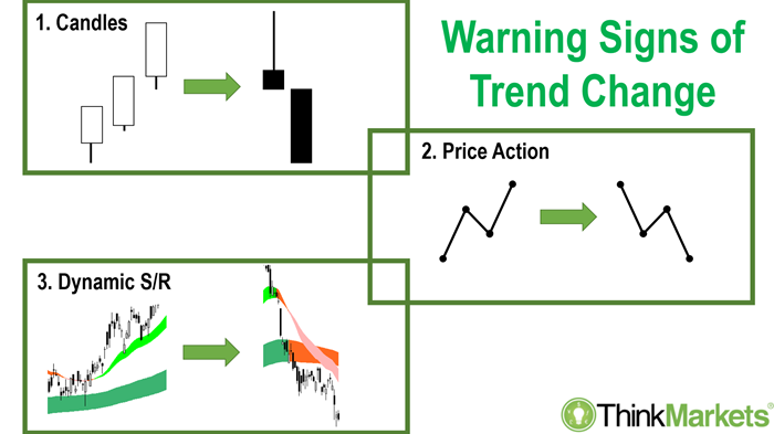
In this article, I'll discuss the second pillar, price action. With price action, we're going to take our technical analysis to the next level! The price action model I'll show you here builds up from single candles into multiple candles, into weeks and months, and so on. The goal is to establish a system for identifying longer-term trends, but more specifically, when long-term downtrends are transitioning into long-term uptrends. This, I find, is the best time to buy a stock in a bear market.
Price action model
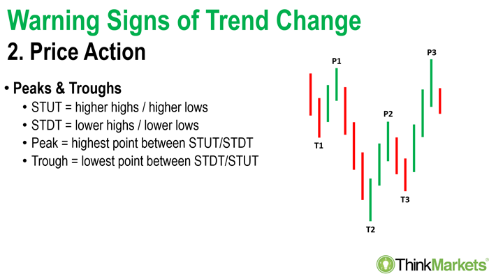
Firstly, we need to identify peaks and troughs. Rising peaks and rising troughs defines a medium-term uptrend, whereas declining peaks and declining troughs defines a medium-term downtrend. So, how do you identify a peak and a trough on a chart? Fortunately, this is very simple. A peak is the highest point between short term uptrend and a short-term downtrend, and a trough is the lowest point between a short-term downtrend and a short-term uptrend.
Ok then, what's the definition of a short-term uptrend and a short-term downtrend I hear you ask? A short-term uptrend is defined as higher highs and higher lows. So, we're literally assessing on a candle-to-candle basis if today's high is higher than yesterday's high and if today's low is higher than yesterday's low. If this condition is a tick, then the stock you're assessing is in a short-term uptrend!
Of course, this is eventually going to change. The definition of a short-term downtrend is lower highs and lower lows from one candle to the next. Peaks, therefore, are simply the pointy bits between your short-term uptrend and short-term downtrend, and troughs are simply the pointy bits between your short-term downtrend and-term uptrend. Another way to think about it is peaks look like a capital "A" on the chart and troughs look like a capital "V".
Now that we know how to identify our peaks and troughs, let's establish some rules on how to build these patterns into actionable trades. The relationship between peaks and troughs as they develop on a chart helps us understand the balance between demand and supply for the stock in question. The only way you can get higher troughs is if demand is building, that is, there must have been more demand on the last pull back than there was on the one before. Similarly, the only way to get higher peaks is if again, not only is demand building – obviously assisting the price to push through the supply at the last peak – but there's every chance in addition to building demand, supply is also diminishing.
Think about what the combination of these two facts means for your stock very carefully! Building demand and diminishing supply! That sounds pretty good for your stock to keep going up, and this is the crux of what I want you to lookout for when assessing if a stock has a chance of turning around it's bear market trend. It's certainly far more sensible than saying "Oh it's a bear market, I'm gonna buy anything that's gone down because it's probably cheap!" The problem with that logic is you run the risk of catching the proverbial "falling knife" when the stock price keeps going down.
So, by using this method, we're looking for signs of a change in the demand-supply dynamics to indicate demand is once again overwhelming supply. In effect, we're letting the market tell us what it wants to do, rather than imposing what we think it should do simply because a stock has fallen a huge amount from its highs.
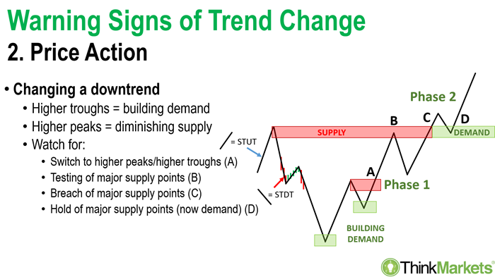
In the above diagram, Point A is really the first point where we might get involved with picking the bottom of a long decline in the price of a stock. It's where we're waiting for those two higher troughs to indicate the all-important building demand required to indicate cash is moving back into this stock, that investors are once again seeing value there.
There's always supply around, particularly in a bear market. So, the next important trigger is to wait for a break above the definitive "middle peak". Finding the middle peak is easy, if you've got two troughs, by definition there must be a peek in between those two troughs! If we can close above the middle peak, the supply there has been eliminated. It shows demand means business. So, we're going to wait for a break above the middle peak first. This is what I call a Phase 1 turnaround trade. Note, it's still super-high risk here because it's so early in the turnaround.
If you've had a big bear trend like many of blue chips have suffered in a bear market, the next important step in assessing a turnaround after Phase 1 is to look up. By this, I mean look up to the next major peak. It's going to be bigger than the rest, and it will probably have a lower peak on either side.
Big major peaks represent the next major test for the stock in question to complete its turnaround. This is Phase 2. Only very aggressive traders would tackle Phase 1, it's too early in the turnaround process to enter with sufficient confidence the bear trend is over. I prefer Phase 2, that is, waiting until we hit some of those big peaks from the past and we've worked through them.
At point B the demand-side has interacted with the supply at the major peak. They've removed some of that supply. Now, there's no guarantee there isn't plenty more supply there, potentially even more than the demand-side can handle. This is why I use an ongoing process to confirm a Phase 2 entry.
It could take a few Point B's to complete the process of dealing with supply at the major peak. The best indication supply has been exhausted is if the stock's price closes above the major peak. If this occurs, then chances are that pesky supply is gone. So, it's Point C and Point D where I prefer to get involved in a turnaround.
This is the strategy I teach attendees of at my
weekly webinar on Tuesdays. Everyone is welcome to join. I analyse stocks for them in real time, providing a detailed technical and fundamental valuation for each company we investigate. It's plenty of fun and the people who attend tell me they learn something new each time.
If you'd like to attend, follow this link to register, it's a free event!
Case Study 1: Monadelphous Group (MND)
Back to using price action to spot valid turnarounds in the market, and now for some practical case studies from ASX listed stocks. The first case study is Monadelphous Group (MND). I deliberately put this one first because I wanted to demonstrate the best time to use price action, or any technical analysis, is in a great uptrend. Yes, we love to find bargains, we love to pick the bottom on something, but I still feeL Plan A must be finding a stock which is bottom-left top-right on the chart.
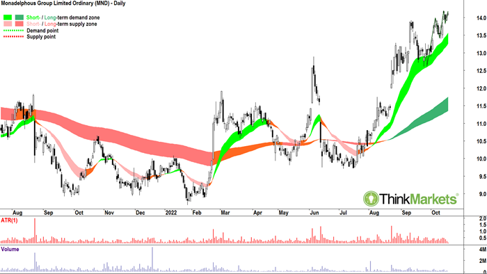
Monadelphous certainly fits this bill. It has a bunch of white candles, the price action is good, I've drawn a little bit at the end there, but more broadly speaking it's solid, and my long-term trend ribbons (light- and dark-green zones) are both pointing up. This is all of the Three Pillars stuff here. So, Monadelphous is my top pick if you're looking for a blue-chip stock in the current market environment.
Case Study 2: Ansell (ANN)
But I know you want bargains! The couple of charts are more about finding bargains. The next one, Ansell, was a little bit of a pandemic winner turned loser. With this case study, I'm trying to find a beaten down blue chip. We all know what Ansell does, it's a very defensive stock, but it had some problems back in January with a big profit downgrade as personal protective equipment (PPE) sales started to fall away.
Again, I'm not trying to catch a falling knife here. I wouldn't have even contemplated buying Ansell on the way down. Instead, I'm waiting for signs demand is retuning, and it's retuning in sufficient quantity to deal with the prevailing supply. Equally important, I'm also looking for signs the supply-side is backing off, that is, their desire to exit is waning.
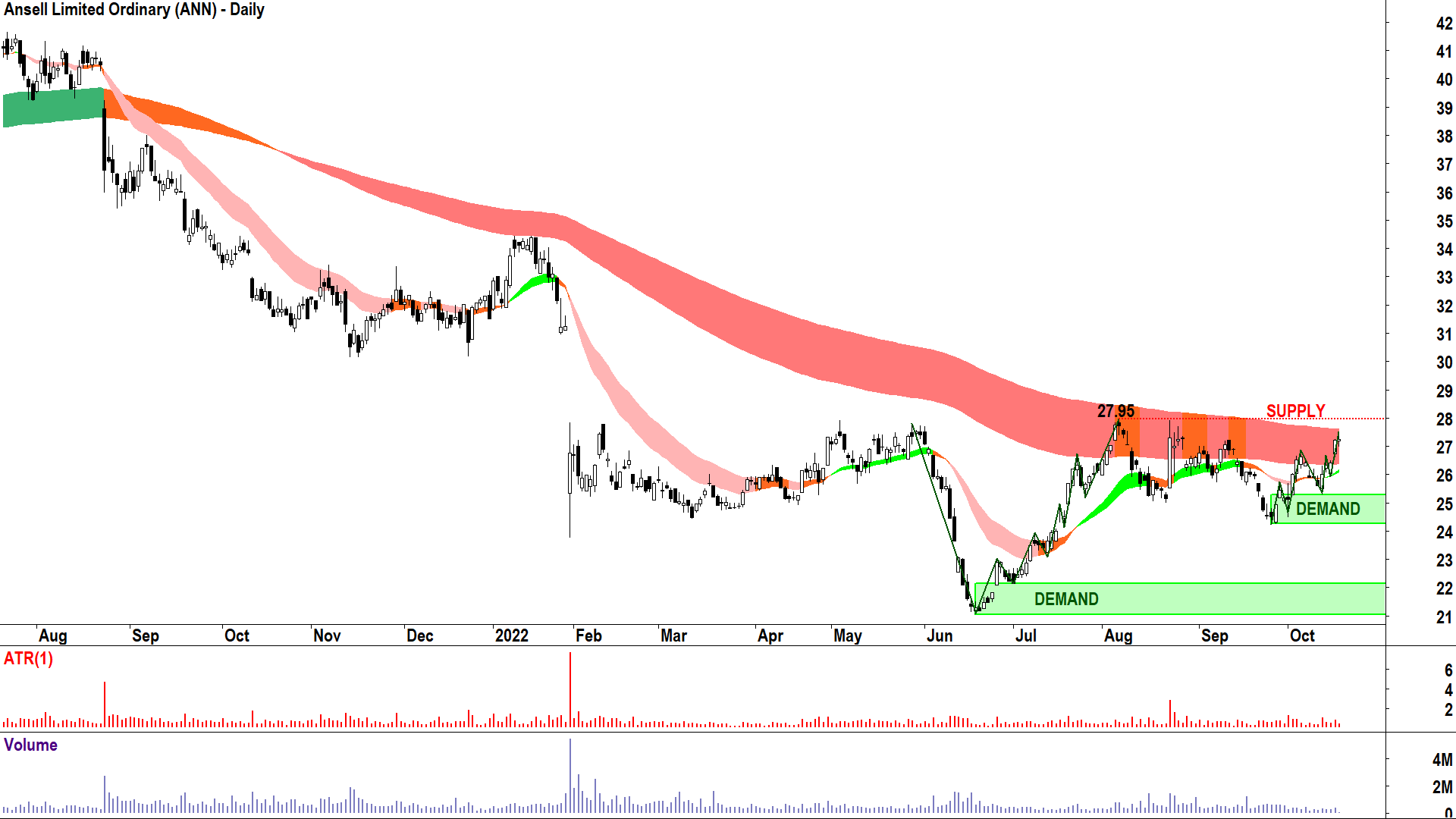
After the June low you can see how Ansell has started to build demand. It's had a rally into the major supply area around the May high and it caught up to the long-term downtrend ribbon (dark-pink zone). Since May, it's just kept pushing and pushing and pushing into it this area of supply. But! This is still Point B kind of stuff, not Point C or Point D yet! So, for Ansell, it's just a heads up for now. Just like in the cooking shows where they start preparing a dish and then say, "This is one I've prepared earlier", the next couple of case studies are going to be more advanced.
For Ansell though, I suggest it's building, though still in Phase 1. The transition to Phase 2 would occur on a break above $27.95 followed by a re-test (i.e., a decline back to the old supply zone), and hold (i.e., it does not move below the supply zone, but rather, bounces off it). Then we'd be off again, and that's when I'd want to get involved in Ansell.
See, I'm not looking to get in at the lowest price in a stock's downtrend. I'll never know a low is a low if I haven't waited for the signs of building demand and diminishing supply first. For me, bargains are irrelevant. I just want to be in a stock when there's excess demand. I couldn't care less where the price was last week, last month, or last year. It's totally irrelevant to making money in the market. So, I'm perfectly fine not buying Ansell around its June low at $21. I'd happily buy it at $28 once it's completed Phase 2. It's not the bottom, sure, but it's not like I'm paying the $45 it was at the top either. I'm happy to get in at $28 and ride the next bull market – wherever that may lead.
Case Study 3: Life 360 (360)
The next case study is another market darling which lost its shine, Life 360 (360). This company operates a mobile app and makes devices which allow you to keep tabs on your family members. It's going gangbusters in the USA. But, like many technology shares, its valuation got way ahead of itself, and when the bear market struck, well we know what happened next – just look at the chart!
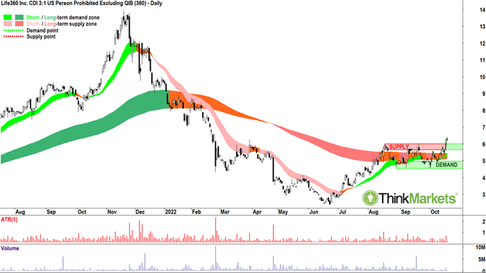
This is a little bit further along than Ansell. It's more Phase 2. Now we've actually pushed through all of that supply at the major peak. Also note the recent price action I've drawn in – how similar it is developing to the price action from the June-July low. You can see how bullish price action patterns repeat.
In summary, 360 is doing a fine job of turning around. It's been in a solid consolidation phase since August beneath the major peak. It's worked its way back above the long-term trend ribbon which has also changed from downtrend (dark-pink) to neutral (orange). Importantly, those trend ribbons aren't acting as resistance anymore, they're acting as support – and in the last few candles, which are great by the way – it's pushing higher again. Given we're through Phase 2 here, I'd personally be a happy buyer of 360.
Case Study 4: Data#3 (DTL)
In the final case study, I wish to demonstrate a variation on the theme so far. There is one occasion when rising peaks and rising troughs in combination isn't strictly required. Occasionally, the supply at the major peak is substantially motivated to cause an extended consolidation beneath it. Apart from understanding how price action can be used to identify turnarounds, the other mini message within today's article is this idea of working through supply and the importance of those key supply zones from the past.
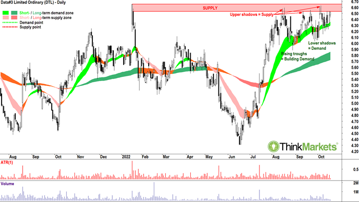
In the above chart for cloud solutions and tech support company Data#3 (DTL) we can see how interacting with a major supply zone can play out. Note the sheer belligerence of the supply at the 18 January 2022 high. It's caused a compression in the peaks and troughs. Clearly, the relative location of the peaks is a bit wobbly, but the key message here is: that's not a bad thing if you're compressing into a major supply zone. The important thing in such scenarios is the troughs are still rising. This tells us demand is building, and as long it continues to build, there remains a high probability the last bit of pesky supply is eliminated and the stock progresses to Phase 2. The trigger for Phase 2 progression is a close above the major peak.
Another handy little side note in this chart is evidence of how upper shadows indicate supply in the market – a concept I addressed in last week's article. It's just so clear in this Data#3 chart how upper shadows in the supply zone reinforce the notion supply is working against the demand-side. Similarly, note the lower shadows at each of those rising troughs within the compression area. Remember, lower shadows are the fingerprints of demand! In summary, my view is Data#3 will qualify as a buy once it has closed above the 18 January high of $6.65.
The Data#3 chart is such a wonderful case study, as are the previous three. The goal with these charts is to provide you with a few great visual cues on what type of price action to look for through the various stages of a turnaround. I find visual cues are the best, and it's helped me in the past to have them nearby when I am conducting my stock analysis. So, feel free to printout each of the charts in this article and stick then on the wall where you do your analysis (click on each and it will launch into a new web page, then right-click and print)!
There's the old saying when it comes to learning, "You don't know what you don't know". Hopefully in this article, I've shown you a few things you didn't know, and perhaps also sparked a little excitement and a little inspiration to go off and learn a few more things you don't know as well!
TM: Watch Carl discuss price action, the case studies above, and one more on Ausbiz's the trade segment with Kyle Rodda:

Download my Bear Market Survival Guide eBook:
https://www.thinkmarkets.com/au/lp/2022-bear-market-survival-guide-ebook/
--------------------------------------
What's Inside?
--------------------------------------
This eBook will help you to navigate a bear market and learn strategies that traders use to find opportunities during bear cycles.
- Preparation - Bull vs Bear (and why it matters): Are we really in a bear market? And if so, how long will it last and how fall are markets likely to fall? What can we learn from the past?
- Opportunities: Learn how to identify resilient companies and diversification strategies, along with shorting and hedging techniques.
- Protection Strategies: Gain a better understanding of risk management, how to use charts to identify trends and how to diversify your portfolio during downtrends.
Any opinions, news, research, analyses, prices or other information contained on this website is provided as general market commentary and does not constitute investment advice. ThinkMarkets will not accept liability for any loss or damage including, without limitation, to any loss of profit which may arise directly or indirectly from use of or reliance on such information.