Star Wars, Lord of the Rings, The Godfather, Back to the Future. History is littered with trilogies which changed the way we see the world. Well, this third and final part in my 3 Pillars of Trend Change Trilogy is destined to be a Return of the Jedi – better than its prequels!

Highlights:
- Learn the difference between dynamic and static support and resistance
- Learn how to use moving averages to identify trends in a stock's price
- Real life case studies, including the Nasdaq and several ASX stocks to watch for potential buys
- Print and save reference charts of key dynamic support and resistance patterns
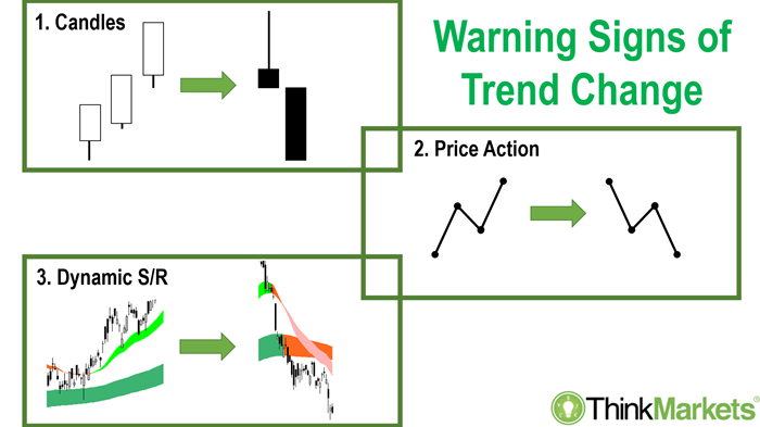
This is the third part of our three-part series in which I've introduced the 3 Pillars of Trend Change. Again, the goal is to provide a theoretical grounding in the relevant concepts, bolstered with several practical case studies using ASX stocks. Before we get started, if you haven't already, make sure you've reviewed the materials from
Part 1: Japanese Candlesticks, and
Part 2: Price Action.
This week's topic, the third pillar of trend change, is Dynamic Support and Resistance (DSR). I expect many of you have heard of support and resistance, but possibly the "dynamic" aspect is a little foreign. As you might expect, "dynamic" simply means moving. So, DSR refers to moving support and resistance.
Static Support and Resistance
In
Part 2 we dealt with price action structures called peaks and troughs. Each peak is formed by a reversal in the short-term trend from up to down. Peaks occur due to an excess of supply in the market for a stock at a particular price. It's a safe bet, at the peak's price, the stock in question experienced an influx of supply, a reduction in demand, or a combination of both.
Given a peak is naturally a high point in price, it's a point where some investors regret not getting out. Some of these investors may wish to reverse this perceived mistake by selling if the price should recover back to the peak. This creates what I like to call "latent supply" at the peak, that is, supply which is contingent on the price achieving a particular level. Because of the latent supply associated with a peak, we can assume there is an increased probability the price falls back again from the peak should there not be enough demand to sustain upwards momentum.
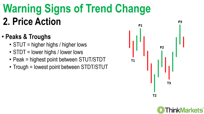
For a trough, it's just the opposite. It's a low point, and it can only occur if there was an excess of demand in the market for a stock at a particular price. Some investors will rue not buying there before, others will sense it's where the smart money was buying last time and expect they'll do so again. You guessed it, we can expect "latent demand" at the trough! Because of the latent demand associated with a trough, we can assume there is an increased probability the price rallies from the trough should there not be enough supply to sustain downwards momentum.
What I've described so far is the traditional support resistance you've already read about in those technical analysis textbooks gathering dust on your bookshelf! Don't get me wrong, I agree there's tremendous value in understanding the definition of peaks and troughs and how they can assist in identifying key areas of support and resistance on a stock's chart. But let's twist slightly the language we use to describe the notion of support or resistance.
In a world where you can trade long or
short, the words "support" or "resistance" become meaningless. Is a trough a point where prices are being held up (yeah, ok, in this case you might call it support), or is it where prices are resisting going down? Shouldn't we then say there's resistance at the trough? It depends on your point of view! Likewise, is a peak resistance to going up or support of the excess supply in the system?
I've argued for a long time the terms "support" and "resistance" are misleading, and therefore are quite useless in technical analysis! I prefer the terms "excess supply" and "excess demand" respectively. They just make more sense in describing what actually happened at a peak and a trough. Remember, all good technical analysis associates any observed phenomena with mantra of "interaction between demand and supply equals price".
Second, whilst there is tremendous value in understanding points of excess supply and points of excess demand from peaks and troughs, each formation is static. They never move! A peak on BHP's chart at $42.63 will be at the same point in price and time forever. My research suggests there is another form of support and resistance (hahaha there's those terms again! 😁) which expresses itself in a stock's chart, one which moves and adjusts with the pace of a trend. Enter the concept of Dynamic Support and Resistance (DSR)!
Enter, the Moving Average
I like to use moving averages to identify potential areas of DSR. Moving averages are a basic technical analysis tool I'm sure you'll be able to find on your trading platform. We certainly offer them on our
ThinkTrader App. But it's not just the plain old vanilla moving averages I like use to find DSR on a chart. I want to use "exponential" moving averages, or "EMA's" as they are generally abbreviated to.
To find these on your charting platform you might have to plot a simple moving average (SMA) first and then right click on it, or there's probably an option in the parameters box to switch the method of calculation from simple to exponential. I don't want to get into the math, that's what Google is for, but simply, the calculations powering EMAs make them respond faster to movements in the underlying price upon which they're derived.
This is very important. Any moving average is an average of the price over a specified period (I'll tell you which periods I use in second!). The average moves as each new data point (i.e., each new trading session) is added to the sample, automatically kicking out the oldest data point. We'll discuss the pros of moving averages soon, but the major con is all moving averages are dumbed down representations of the price. Like any average, they smooth out peaks and troughs within the data sample. Smoothing isn't bad, in fact, as we'll see soon it can be quite advantageous. Ideally, however, we don't smooth out the price action so much we lose sensitivity to what's occurring in the underlying data. EMA's provide the right balance between smoothing and sensitivity.
(A quick plug for
price action!) It is the most sensitive method of technical analysis. You cannot get more coincident with price than what is happening in the candlesticks and the price action. But, sometimes, due to the nature of short-term trends (again, see
Part 2), the signals we derive from analysing peaks and troughs can be volatile. This can generate false signals to buy and sell which can be dangerous.
So, moving averages slow things down, but using EMAs reduces the lag compared to price action. What EMA's do really well, is summarise the price action very quickly. In
Part 2 we demonstrated how meticulous you need to be in spotting short-term uptrend and downtrends to define our peaks and troughs. Going candle by candle and comparing highs and lows can be tedious and time consuming!
EMA's allow us to distil the complex very quickly into simplicity. Don't bother to check highs and lows, if a particular EMA is rising, it signals an uptrend over the duration the EMA is measuring. If it is declining – you guessed it, downtrend! Another common method of trend identification using moving averages is to use two EMA's of different durations, one shorter and one longer. Again, quite simply, if the shorter duration EMA is above the longer duration EMA, it signals an uptrend, and the opposite true for a downtrend. If the two EMA's are diverging, the trend is strengthening, and if they are converging, the trend in weakening. So, EMA's provide the technical analyst with unequivocal indications regarding the trend with a fraction of the work required to do the same using price action.
Dynamic Support and Resistance
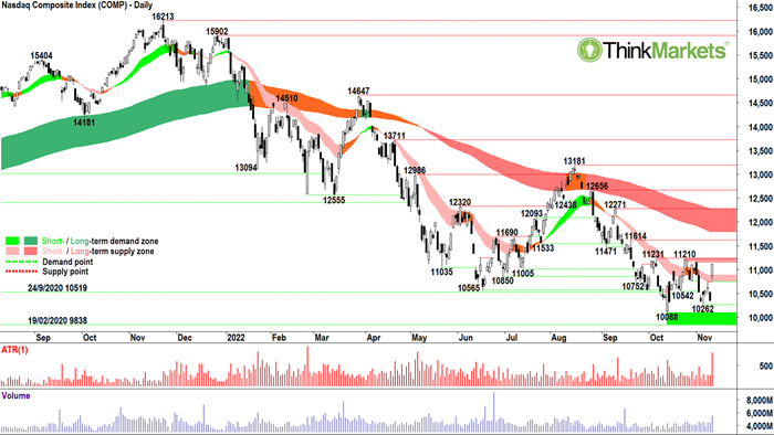
OK, let's get to the application of DSR and how it manifests itself on a chart. My first case study is the
Nasdaq Composite Index (COMP). This is the archetypal example of how DSR works. First, let me specify the durations of EMA's I use. For the short-term trend, I use 21 and 34 EMAs. These are the light-pink and light-green ribbons on the chart below. For the long-term trend, I use 144 and 233 EMAs. These are the dark-green and dark-pink ribbons on the chart below.
Why these durations? Well, some really clever math boffins might have noticed each duration is a Fibonacci number. That's more coincidence than grand design, but perhaps its not! You see, the reason I use these durations is because they work so darn well! Chicken and the egg stuff here – Fibonacci numbers are very popular in the trading world, and perhaps there's some self-reinforcing behaviour going on.
Many of you have you've seen how well these trend ribbons work after watching my various media appearances or
attending my weekly Tuesday webinars. (Make sure you attend my weekly webinars, they're free, they're awesome, and you'll learn lots!) Anyways, my trend ribbons work like clockwork. Time and again my model defines where trends begin, where they end, and where they are supported in between. After using them for over 20 years, I have total confidence in them.
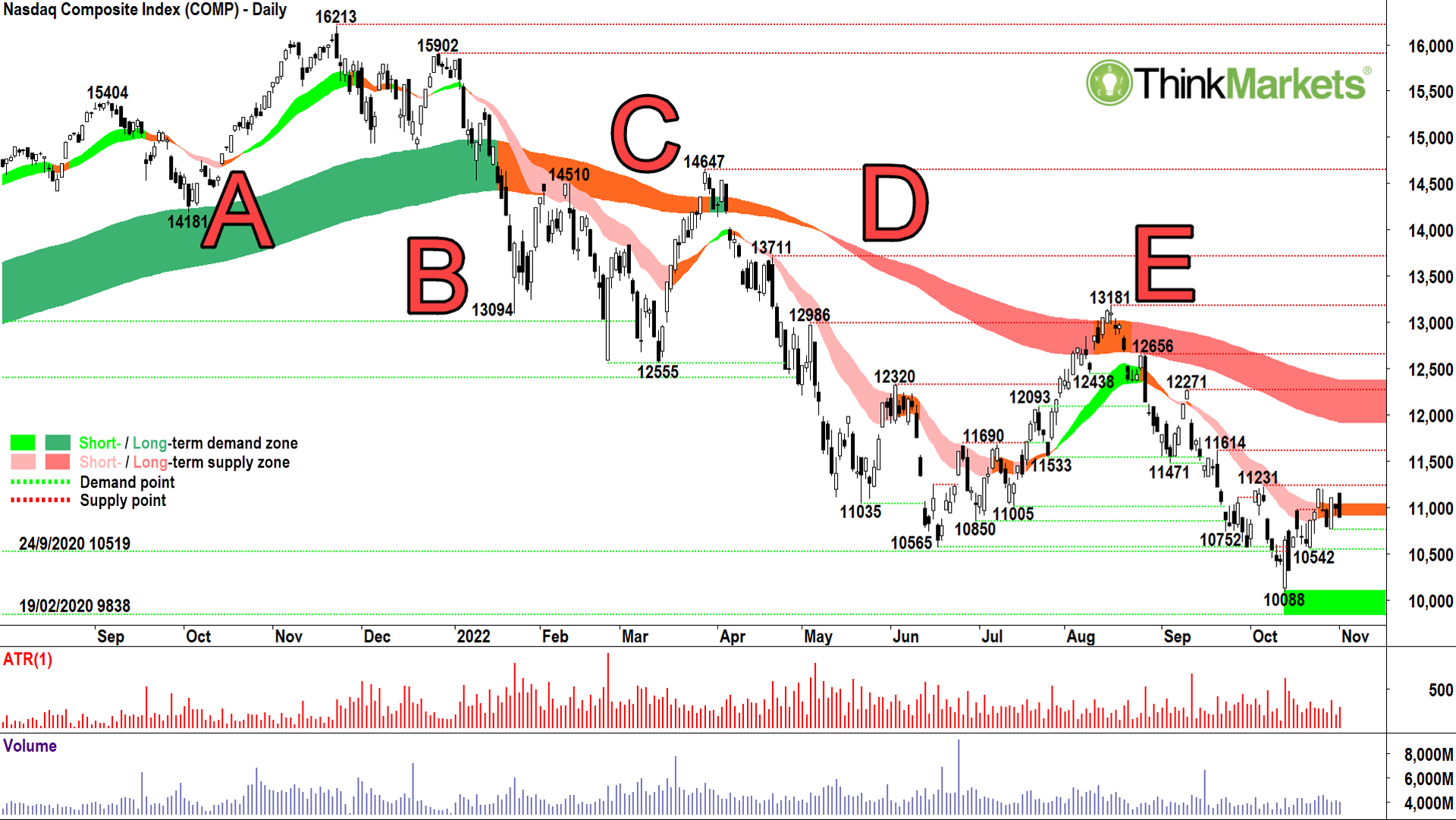
Note how at Point A the long-term trend is up as evidenced by the 144 EMA trading above the 233 EMA. I simply colour the area between the moving averages to create ribbon effect. It's a traffic light system, so dark-green for up, orange for when the 144 and 233 EMAs are converging, meaning the uptrend is losing momentum, and dark pink for when the 144 EMA is below the 233 EMA and they're both heading down.
So, trend change can be defined by the direction of the EMA's and by whether a trend is gaining or losing momentum. We can for the most part, now replace price action with EMAs for the purpose of trend identification. It's certainly far quicker and easier to apply.
But this article is about DSR. As an added bonus, on top of rapid trend identification, the trend ribbons also help us define key areas of potential excess demand and excess supply not usually found in the price action. Notice how on the way up the price appears to be cushioned by the dark-green zone. Let's go back a bit further and see how the last Nasdaq bull market played out.
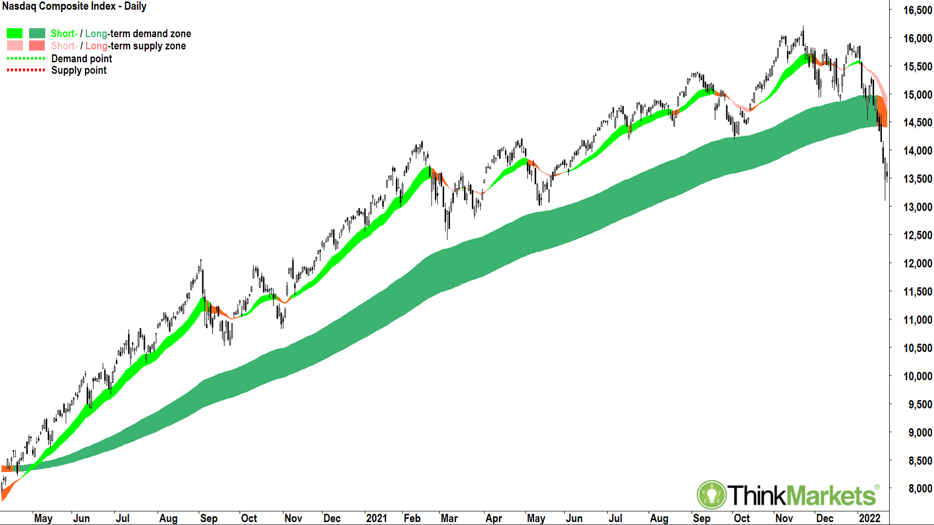
It appears each time the price approached the dark-green zone an invisible force pushed it back up to new highs. That invisible force is simply excess demand. Why did it kick in so reliably in the dark-green zone? Well, the honest answer is, who really cares!? It just did. It also did it in the last bull market before the one on screen, and in the one before that (go check!). Plus my trend ribbons also work on pretty much anything you want to apply then to. Again, who cares why? Do you care why your car's engine somehow manages to turn the wheels which get you to work each day? Nope, didn't think so!
Another key indicator of trend change, particularly useful in the orange-undecided zones, is when the price breaks beneath the dark-green zone (i.e., back to the first Nasdaq chart above, at Point B), and then instead of recovering back above it, fails at or near the zone and begins to trend lower (i.e., pretty much either side of Point C). This is how long-term uptrends transition into long-term downtrends, and here the word "transition", is super important. It's the norm, not the exception. The balance of demand vs supply rarely flips instantly. Rather, it shifts gradually over time.
For the Nasdaq, my DSR ribbons allowed me to
declare as early as January the bull market in US equities was over.
At point D everything was confirmed as the long-term trend ribbon changed its colour to dark-pink, an indication a technical bear market had begun. The whole point of DSR is this: in an uptrend, the DSR ribbons act as an invisible hand holding prices up (i.e., dynamic support!). In a downtrend, they do the opposite, they act as an invisible hand preventing upside movement (i.e., dynamic resistance!). Note how well this is demonstrated in the Nasdaq chart, particularly at Point E.
Fast forwarding to today, I can't call the current bear market in the Nasdaq over until we go through the opposite process, that is, of getting back up to the dark-pink DSR ribbon, testing it, breaking above it, retesting and holding above it, and finally, pushing higher off it again. Only after this last act can I say with confidence the long-term trend ribbon has transitioned from offering dynamic resistance to dynamic support, and only then can we say the new bull market has begun!
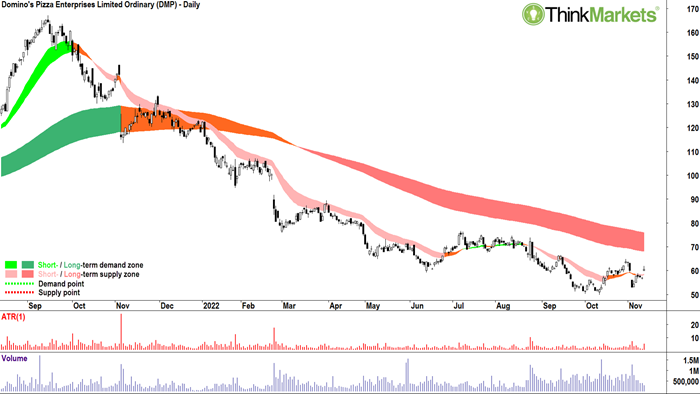
Case Study 2 is
Domino's Pizza Enterprises (DMP). Hopefully your eye is now tuned into the pattern/picture which is long-term trend change. On the left-hand side of the chart below we can see how long-term trend change from uptrend to downtrend occurred. First, Domino's broke through the dark-green uptrend ribbon, then it failed to recover back above it, and then it broke decisively lower. It was all downhill from there!
Domino's is one of those "favourite blue chip" stocks among investors. It's one of the most asked about stocks in
my weekly webinars.
I get it though. It was so reliable for so many years, especially during the pandemic. Clients say, "It was $180, it's now only $50, therefore it
must be cheap." I say, "Look, I'm not averse to buying Domino's, but it needs to go through the transition process back to a long-term uptrend first. I can't buy it now because I'm
not confident it hasn’t finished going down."
Domino's short-term trend ribbon is flip-flopping around, and maybe if you squint, you'd say it was getting better. But, and a big but here! The long-term downtrend has not even been challenged. The next step will be to challenge the dark-pink trend ribbon, test it, break above it, retest and hold above it, and finally, push higher again (i.e., the latter implies the ribbon has transitioned from dynamic resistance to dynamic support).
Our third case study looks more constructive. I brought
Ansell (ANN) to your attention a
couple of weeks ago in our discussion of price action. At the time, I noted how the price action was improving, potentially signalling an end to the long-term downtrend. Today, we can see how the process of long-term trend change is playing out with Ansell's DSR ribbons. Ansell is once again trading above the long-term downtrend ribbon which has transitioned back to orange. Importantly, after trading above the long-term trend ribbon, it retested and held it. Today's push higher suggests the long-term trend ribbon is once again offering dynamic support – a key bull market trait!
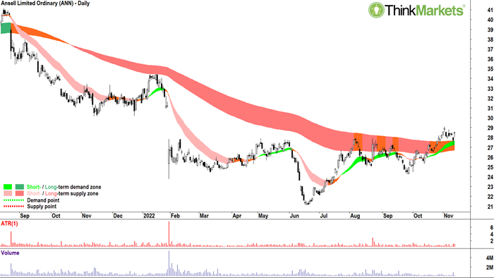
Before we leave Ansell, it's important to note just how accurate the long-term downtrend ribbon was at providing dynamic resistance. Time and again it signalled the exact point where a short-term uptrend terminated, and the price reversed lower to re-establish the long-term downtrend.
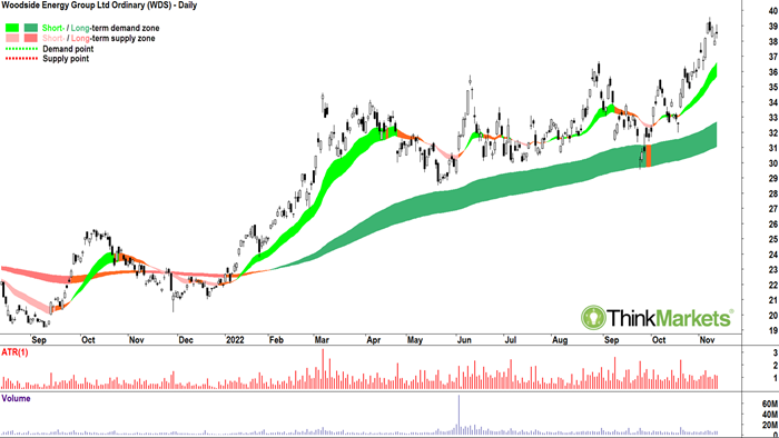
I must finish with a more bottom-left-top-right chart to demonstrate how the model can take you through the turnaround stage and into the trend following stage. In the
Woodside Energy (WDS) chart we can see clearly how dynamic support is reinforced at the dark-green long-term uptrend ribbon. I suggest Woodside is a picture of excess demand at this stage, with plenty of demand-side candles, higher peaks and higher troughs in the price action, and well established and strengthening short- and long-term dynamic support ribbons.
Conclusion
Given the sheer volume of theory entailed in describing trend change thoroughly, I chose to discuss each in isolation. However, I hope you can now review all the material presented over the last few weeks together to see how each complements the other. There is certainly a build-up in theory from Japanese candlesticks to Price Action, and finally to Dynamic Support and Resistance. Put them all together and you should have a fantastic model for identifying when stocks which have struggled in the past are once again exhibiting the hallmarks of excess demand.
Strict adherence to these principles will prevent you from trying to buy a stock on the way down simply because it "looks cheap", and most importantly, it will prevent you from catching the proverbial
falling knife! Rather, you can now focus on building up the various checklists denoting the various phases of trend change, ensuring you have as much evidence as possible excess demand has returned to a stock and it's once again safe to buy.
I trust these three articles serve as a useful repertoire of technical analysis for you to use for many years to come!
TM: Watch Carl discuss DSR, the case studies above, and one more on Ausbiz's the trade segment with Kyle Rodda:

Download my Bear Market Survival Guide eBook:
https://www.thinkmarkets.com/au/lp/2022-bear-market-survival-guide-ebook/
--------------------------------------
What's Inside?
--------------------------------------
This eBook will help you to navigate a bear market and learn strategies that traders use to find opportunities during bear cycles.
- Preparation - Bull vs Bear (and why it matters): Are we really in a bear market? And if so, how long will it last and how fall are markets likely to fall? What can we learn from the past?
- Opportunities: Learn how to identify resilient companies and diversification strategies, along with shorting and hedging techniques.
- Protection Strategies: Gain a better understanding of risk management, how to use charts to identify trends and how to diversify your portfolio during downtrends.
Any opinions, news, research, analyses, prices or other information contained on this website is provided as general market commentary and does not constitute investment advice. ThinkMarkets will not accept liability for any loss or damage including, without limitation, to any loss of profit which may arise directly or indirectly from use of or reliance on such information.